Disney is one of the best online stores that a new entrepreneur can learn from. Every aspect of their online experience has been carefully thought-out and executed.
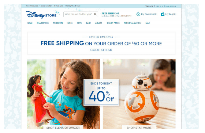
When you first visit the Disney Store website you can immediately see many marketing tactics in play. With one quick glance, you can see the urgency tactic being used, a free shipping offer and promotional deals. Using these tactics, whether on a homepage or product page, can help encourage sales on your own stores.
Next, Disney’s product categories have been designed with the customer in mind. Most shop via product category such home decor, fashion or jewelry. However, Disney recognized that many customers have a favorite character and allows customers to sort for products by character. While your store may not cater to specific characters, the valuable lesson here is to organize products with your customer in mind. You can take a look at your Shopify search data for hints on keywords your customers use to help determine categories.
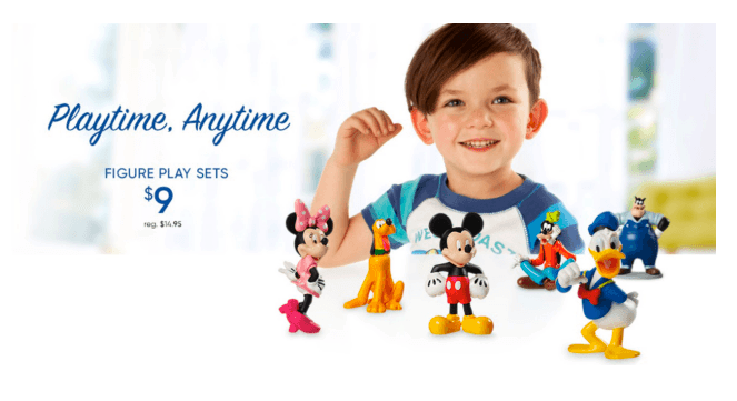
Also, Disney’s images are often attention grabbing. Whether on a home page or product, there’s a notable emphasis on visuals and color. Let’s take a look at the Disney image below. This graphic has a mostly white background, however, the products pop with vibrancy as a young boy plays. The vibrant colors capture a scroller’s attention, making them stop to look at the products. The smiling boy also helps create an emotional reaction to help encourage parents to buy the toy for their son. It’s simple yet powerful details that can help guide your browsers to the right product.
Disney’s top navigation layout is highly optimized. According to Kissmetrics, the first and last item in the top navigation get the most views. It’s evident that ‘New’ was added as the first item because Disney understood that customers wanted to easily view new items. The last top navigation item is ‘Sale.’
Many ecommerce stores find that the ‘Sale’ section is often one of the most popular product listing pages.

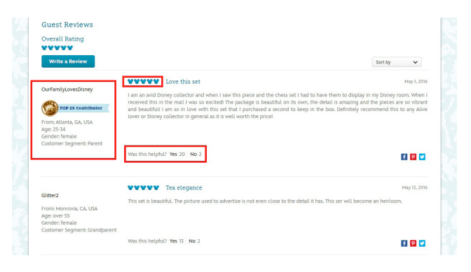
Next, Disney’s reviews section continues to make the brand stand out. Instead of stars, they chose to use the silhouette of their mascot Mickey to stay consistent with their brand. Reviewers are able to create unique usernames and share some personal information which proves to be valuable to customers. You’ll know the age, gender, location and customer segment of the customer who reviews the product. This extra information helps confirm whether or not the product is right for you specifically.
