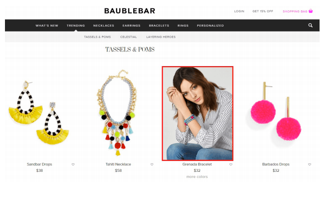
BaubleBar is a great example of a jewelry store to use as inspiration. The navigation bar and its drop-down menu has a clean, minimalist look. It doesn’t interfere with the look of the website. Also, it doesn’t overwhelm the customer as it only has a few subcategories. While a BaubleBar customer browses the product listings, they can choose to see what the piece looks like when worn when they hover over the product image. If they like the way it looks on, they can then choose to visit the product page to purchase the item. On the product page, you can also view customer photos for the specific product. It allows you to view the product on different skin tones and with different outfits and accessories
While a BaubleBar customer browses the product listings, they can choose to see what the piece looks like when worn when they hover over the product image. If they like the way it looks on, they can then choose to visit the product page to purchase the item. On the product page, you can also view customer photos for the specific product. It allows you to view the product on different skin tones and with different outfits and accessories.
BaubleBar also has a loyalty program where customers can earn points for buying products. You can create your own loyalty program where customers earn points for purchases with the Loyalty Reward Points by Sweet Tooth app.
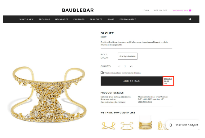
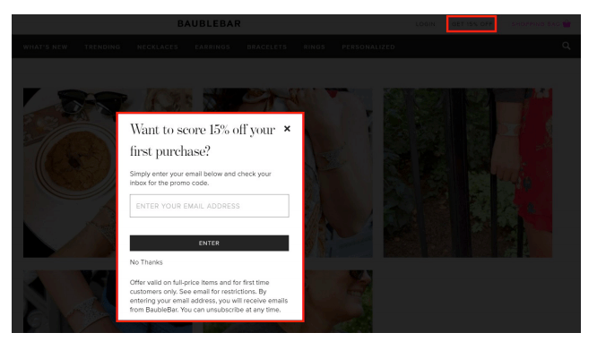
Next to the BaubleBar shopping bag, there’s a ‘Get 15% Off’ link. When a customer clicks on the link an email pop-up appears allowing a customer to get 15% off their purchase for signing up for the email. This is a subtle but effective way to encourage email sign-up.
