As a dropshipper, you know how hard it can be to make a decision when given a lot of choices.
Before you started a store you had to pick a niche – something that can feel agonizing due to the sheer number of options. Then you had to choose specific products. And then you had to decide how you’d market those products. And then you – well, you know where this is going.
With so many possibilities available, it’s easy to convince yourself that whatever decision you make, it’s going to be the wrong one.
These feelings aren’t just limited to dropshippers. They come about because of a phenomenon called choice overload.
In this post, we’ll explore the concept of choice overload and the circumstances that create it. I’ll also give you a list of six things to consider to prevent your store from becoming overwhelming – including recommendations from some successful dropshipping merchants.
Post Contents


What Happens When We Have too Many Choices?

Choice overload results in many different effects – including stress and anxiety – and can even lead to something called choice paralysis. This is what happens when someone overthinks a situation or choice to such an extent that they simply don’t make any choice at all.
→ Click Here to Launch Your Online Business with Shopify
Sound familiar? This is probably something you’ve felt when trying to find the perfect restaurant, or make the best choice when buying a new phone.
Choice overload and choice paralysis are interesting because in general, I’m sure most of us would agree that having options is great. But, these two processes demonstrate that sometimes, it’s too much of a good thing.
And, while both choice overload and choice paralysis can happen in many aspects of our lives, it’s particularly worth thinking about if you’re an ecommerce store owner.
A 2000 study from Columbia University saw researchers explore this concept by setting up a stand with jam samples. They alternated between offering 24 types of jam and six types. They found that while 60 percent of people stopped to sample jam when there were 24 types, just three percent of those people bought a jar. Meanwhile, when there were six jams, only 40 percent of people stopped but 30 percent of that group purchased a jar. Less turned out to be more.
The line between too few and too many options can be a fine one, so it’s important to consider whether anything in your store could be overwhelming potential customers to the point of leaving.
Getting Deep: What is Choice Overload?

We’ve briefly covered what this phenomenon means, but let’s dig a little deeper on choice overload and when it occurs. Researchers at Kellogg School of Management found that four factors are influential in explaining when choice overload could come up.
- Choice-set complexity: How are the options presented to you? Is there a dominant option and how much information is provided for each choice? The more complex the choice is to make, the more likely choice overload is to occur. Complexity doesn’t necessarily just mean the most options, but how difficult it is to pick one. For example, having five options with 50 pieces of information per option is more complex than having 50 options with one piece of information per option.
- Decision-task difficulty: How difficult is it to decide? If it’s something that needs to be decided quickly, the time pressure can lead to choice overload.
- Preference uncertainty: How much do you already know about your options and what you want? Having no preference makes it harder to choose as there are no obvious front runners.
- Decision goal: What’s the goal of this decision? If it’s a conclusive choice – like choosing a new phone – then it could lead to choice overload. This is because it will be more closely considered and analyzed since you’ll only pick one choice from many options.
The good news is that choice overload doesn’t always result in unhappy shoppers. However, it does make the decision-making process stressful – probably not what you want customers to experience when they visit your store.
And when choice overload does have a negative effect, it’s less than ideal. A negative effect could mean people regretting their final decision, wanting to change their minds, or not making a choice at all – a.k.a. choice paralysis.
But if you’re stressed at the mere thought of your customers being stressed, don’t worry! We spoke to some high profile dropshipping merchants and put together a list of six things for you to consider to help prevent choice overload.
1. Think for Mobile Users
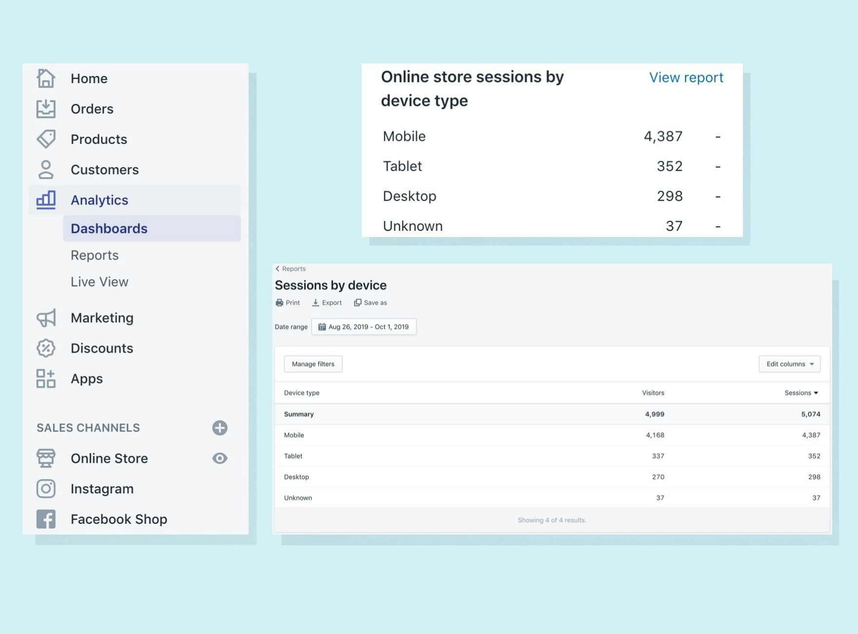
Do me a favor next time you’re on Shopify. Go to the analytics section of your store and scroll down until you see the “Online store sessions by device type” box. Once you’ve found it you’ll see just how many of your store visits come from mobile devices – it’s a lot, right?
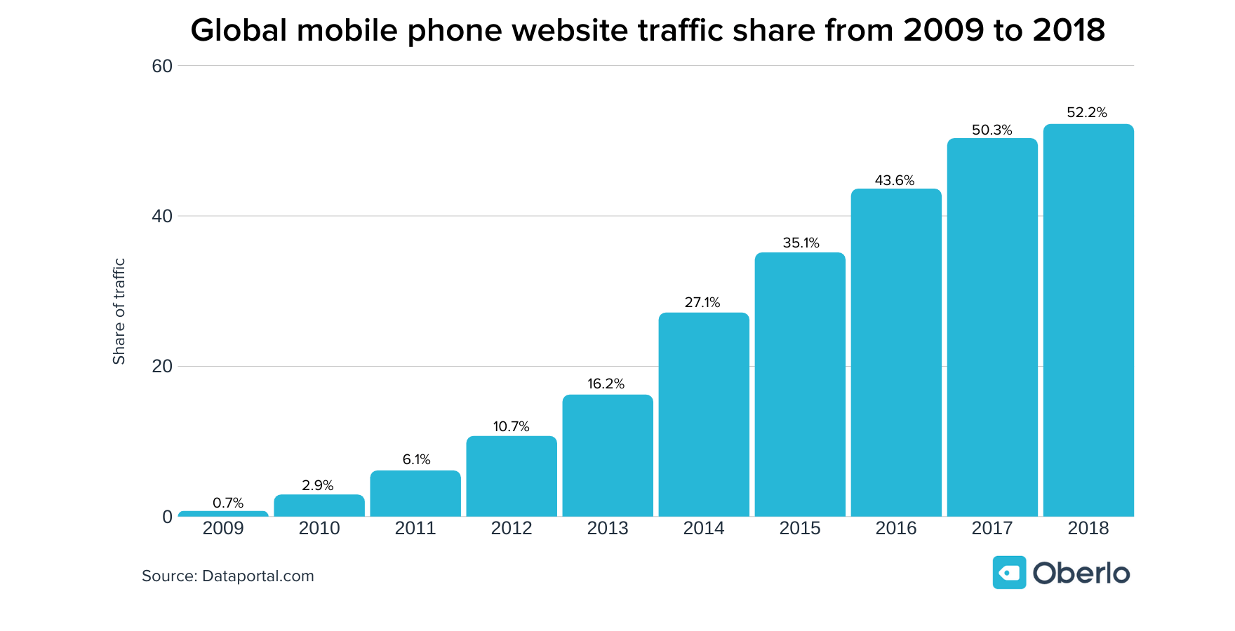
In 2018, 52.2 percent of all website traffic worldwide came from mobile phones, but when you’re constantly editing and viewing your store on a desktop, it can be hard to remember that mobile commerce is huge. Mobile-first design is now more important than ever and this extends to how many products you have and how you choose to display them.
You can easily view your mobile site while on a desktop by right-clicking and going to “inspect,” from there you can use the drop-down menu to view specific devices. Think about implementing filtering options, shortening titles, and reducing the general clutter of unnecessary products. If your store looks intuitive and easy to use, people will be more inclined to stick around and hopefully make a purchase.
2. Start Small and Then Cross-Sell
If you’re just starting out or seriously reconsidering the size of your product range, take a page from Emma Reid’s book.
Emma is a serial entrepreneur who has made over $500,000 in sales with her various dropshipping endeavors. These days she both sells online and mentors fellow entrepreneurs. And she has some strong thoughts about how many products a store should have.
“All my Shopify stores contain less than 10 products,” she says. “A smaller selection allows you to make the design, branding, and story a lot more relevant to your buyers. This helps you sell better, improves conversion rate, and there are just less distractions (even for the customer).”

But the magic of Emma’s approach is how she offers her products. She generally starts with one winning product and gradually adds other items as cross-sells. This is a clever technique because the customer is already prepared to purchase her winning product and is then presented with enticing complementary products immediately before they purchase.
However, if you’re not sure what exact product to sell, Emma says niche stores are a great way to test products flexibly. This way you could end up with multiple winning products and you get the benefit of selling to a similar audience.
3. Let’s Get Analytical
If you’re unsure whether or not you should remove certain products from your inventory or improve the page, leave emotion out of the decision and get data involved instead.
Check the Product Performance
Check your store’s analytics to learn about customer behavior and to get the scoop on how popular individual products are. I recommend doing this in Google Analytics, where you can really dive in deep. If you head to Conversions – Ecommerce – Product Performance, you’ll be able to see your best selling products. And, if you sell products with different variants, you’ll be able to see which variant is most popular and which are seldom purchased.
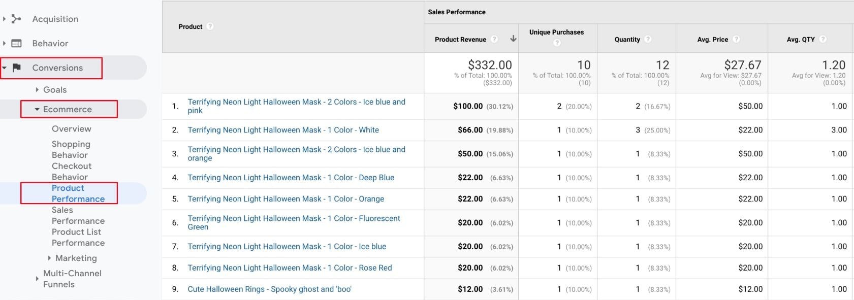
In addition to this, you could also compare the best selling products with the products that receive the highest volume of traffic, going to Behavior – Site Content – All Pages will show you this information. If a product has a lot of traffic but isn’t selling well, take a better look at the page and try and figure out what might be repelling visitors.

Check Product Page Complexity
On that same note, heading to Site Content – Exit Pages will let you see what pages you might need to focus on to keep visitors on your site for longer. In this case, you might have a product that asks your customers to make too many choices, such as size, color, or type. You should ask yourself whether all of these decisions are necessary, or if they might be overwhelming your visitors and leading to choice paralysis.
With all of this information, you’ll be able to make a data-informed choice about whether you keep a product or not, as well as if you need to amend your product pages to make them as straightforward as possible.
4. Harness the Power of Collections
We’ve already covered removing products from your store and using cross-sells as a clever way of offering more items, what about if you do have a lot of products and you’d prefer to keep it that way? This is something successful dropshippers Chris Wane and Harry Coleman know all about.

Chris has been dropshipping for the last few years and has had huge success with his general store, Big Red Gadgets. While he agrees that it’s best to start with a small number of products, for those with stores that have grown over time he believes collections are the key to keeping customers on-site.
“It’s very important to have clear and concise collections that are easily navigated through menus across the store,” he says. “I would make a few broad collections that fit the category of the product.
Harry, whose stores made over $5 million in revenue in 2018, is also a big advocate for splitting products into collections on a general store but suggests starting with a manageable number of items before growing.
“I recommend sticking to just three to four niches,” he says. “That is more than enough to make great money. Now, within those niches on your store, you can have like four to eight products to start out with. You should organize them as collections on your store so it makes it easily navigable for the visitor.”
And, once you’ve found success with a particular dropshipping niche, Harry says store owners should focus on expanding that collection, building on its initial success to really bring in sales.

Making a collection is easy to do. Just head to the Products section on Shopify and then go to Collections and start creating. Chris advises making broad categories over specific ones to avoid overwhelming the customer. For example, a general collection of all bracelets is better than making multiple collections for specific bracelet types – gold bracelets, silver bracelets, and so on.
You can also set conditions so that any future products added to your store will automatically be added to the correct collection. If we go back to our bracelet example, you can set a condition that any product with the word “bracelet” in the title will automatically be added to your new collection – easy!
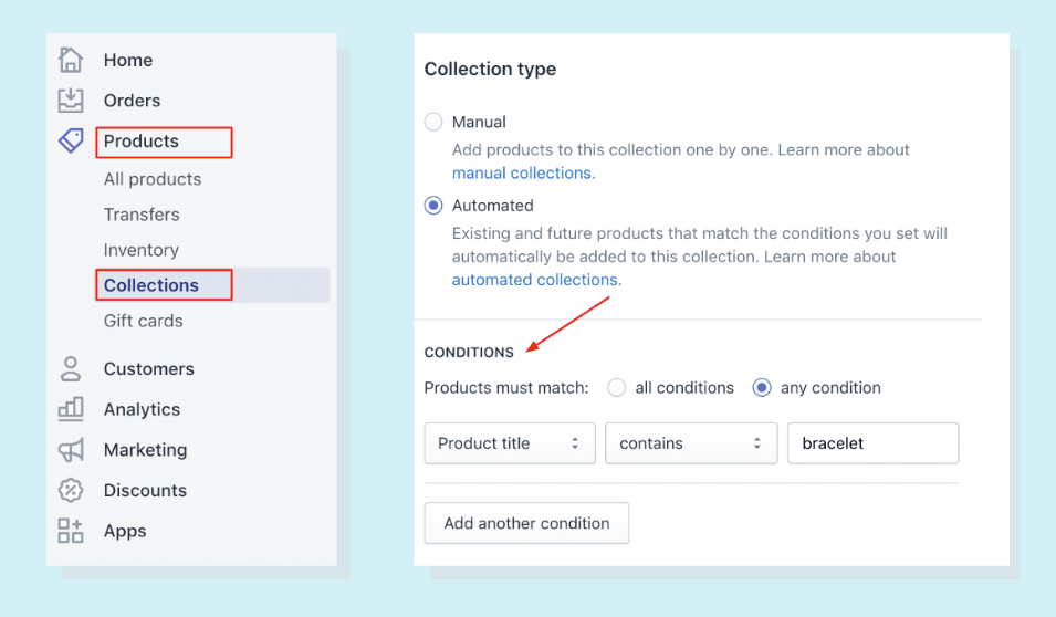
And if you’re using Oberlo, making collections is even easier. Your Oberlo Import List is synced with your Shopify store’s collections, which means you can assign products to collections before you even import them. That way, by the time you do import the product to your store, it’s all ready to go with no further adjustments.
Chris is also a fan of adding filters to large collection pages, to help customers easily pare back options. While not all Shopify themes have this option, there are apps that can help. Filters help by removing all the excess noise from a decision, taking away the items the customer knows they don’t want to buy and leaving them with the remaining relevant options.
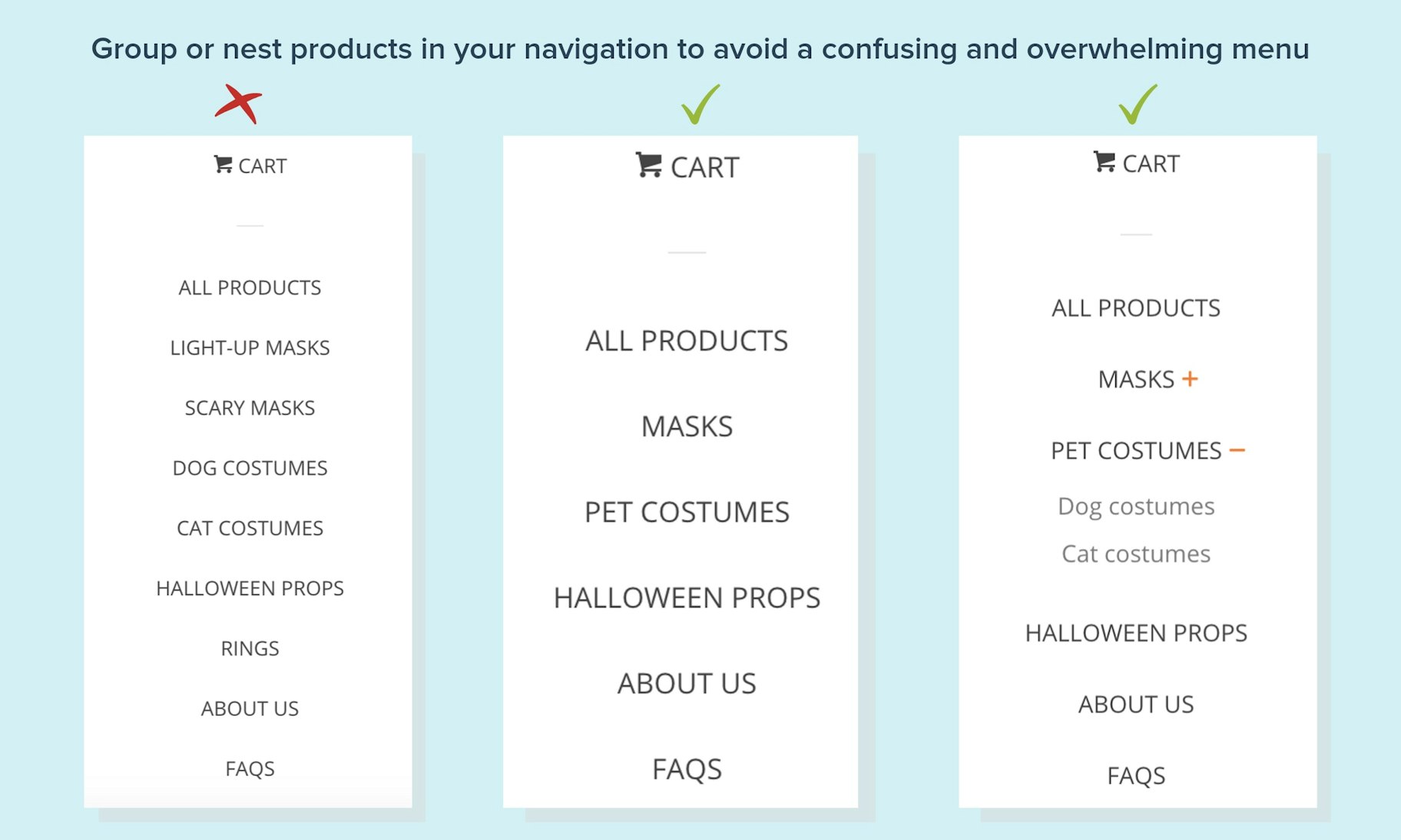
A website menu is supposed to help users quickly find what they want, but it can be tempting to cram them full of options and overwhelm visitors – on both desktop and mobile. And, as Chris mentioned above, having menus that are easy to navigate are key for your customers being able to find what they want swiftly.
If your menu is long, take a look at what you can group into more general categories and think about whether each option is deserving of a slot on the menu. If an item doesn’t sell particularly well, it probably doesn’t need to have prime real estate on your menu.
You could also make use of nesting menus, using a general term as the parent category and showing subcategories underneath them. To do this, go to Shopify and head to Online Store and then Navigation. From there find your main menu, add your product and drag it until it sits underneath its parent category.
Having a “Shop All” or “All Products” menu option alongside your other categories lets your customers choose whether they want to sort through every item you have, or if they’d prefer to simply view a certain type of product.
6. Make it Clear How Each Product is Unique
One contributor to choice overload is having multiple products that all seem extremely similar with only negligible differences. To counteract this, make it very clear in your titles and product descriptions how each product is unique. Note any attributes that set it apart from other products, as well as the particular pain points the item will also help with.
This clarity will not only help your visitors when they initially view your items, but it will simplify their decision-making process as well. And, with such detailed and useful information, there’s a higher likelihood of satisfaction with the choice they make, which is the ideal outcome.
While it’s easy to assume giving our customers a wide selection of choices is a good move, there’s a point where less is definitely more. But, no matter how many products your store has, there are practical ways you can combat choice overload to make shopping a pleasant experience. If you’re concerned that your store has lost purchases due to overwhelmed customers, try some of these fixes – and let us know about it in the comments below.
