Mobile website design is essential.
Why? Because mobile devices are revolutionizing the way we connect, and as a result, the way businesses operate. In fact, the majority of web traffic now comes from mobile devices.
“Mobile is becoming not only the new digital hub, but also the bridge to the physical world,” said Thomas Husson, the Vice President and Principal Analyst at Forrester Research. “That’s why mobile will affect more than just your digital operations – it will transform your entire business.”
In other words, you need a mobile responsive website.
But what is a mobile-friendly website? In this article, you’ll learn all about mobile-friendly websites and see nine of the best mobile website design examples. Plus, you’ll learn how to find out if your website is mobile-friendly.
Let’s get to it.


What is a Mobile-Friendly Website?
Simply put, a mobile-friendly website is a site that is designed and optimized for hand-held devices, such as smartphones and tablets.
And mobile responsive design is the process of creating a website that adapts to the screen size it’s viewed on.
→ Click Here to Launch Your Online Business with Shopify
For our website, we have a mobile-friendly website design. Let’s compare how it looks on desktop and mobile.
In the image below, you can see that the desktop website has plenty of space, the page elements are arranged side-by-side in places, and the text is relatively small compared to the size of the screen.
On the other hand, when you view the website on mobile, the page elements are stacked on top of each other in one long column, and there’s less space around each element. Also, the buttons are bigger to make it easy to tap them, and the text is larger in relation to the page size to make it easier to read.

“The rich and interactive experiences we have come to expect on mobile apps have created new standards and expectations for all digital media including the web,” said Raj Aggarwal, CEO of mobile marketing company Localytics. “The result is websites are evolving to become more app-like in their rich functionality.”
The Importance of Mobile Website Design
Let’s cut to the chase: In the last quarter of 2019, smartphones were responsible for a whopping 52.6 percent of global website traffic.
This means mobile device use now dominates desktop computers.
Plus, the number of mobile users worldwide are expected to grow to 7.41 billion by 2024.
As Cyndie Shaffstall, the founder of marketing company Spider Trainers, said, “Mobile is not the future, it is the now. Meet your customers in the environment of their choice, not where it is convenient for you.”
Mobile devices are also changing shopping habits.
According to Google, 59 percent of shoppers say that being able to shop on their mobile devices is important when deciding which retailer or brand to buy from.
Plus, 70 percent of smartphone owners who made a purchase in-store turned to their mobile devices to research the purchase beforehand.
Finally, many users load mobile websites using slow, weak phone connections. As a result, brands must create a mobile website design that loads quickly.
All in all, the world is now mobile-first – and that’s why you need a mobile responsive website.
8 Design Tips from the Best Mobile Websites
In this section, we’ll take a closer look at eight mobile website design tips that you can use. Plus, you’ll see real-life examples from some of the best mobile websites on the web.
1. Use Large Buttons
Mobile-friendly websites need to have buttons large enough for users to tap them without having to zoom in.
Additionally, there needs to be space between hyperlinks. If links are placed too close together, users might attempt to click on a link and accidentally click on a different one.
Shopify uses large buttons and puts plenty of space between hyperlinks on its mobile website design.
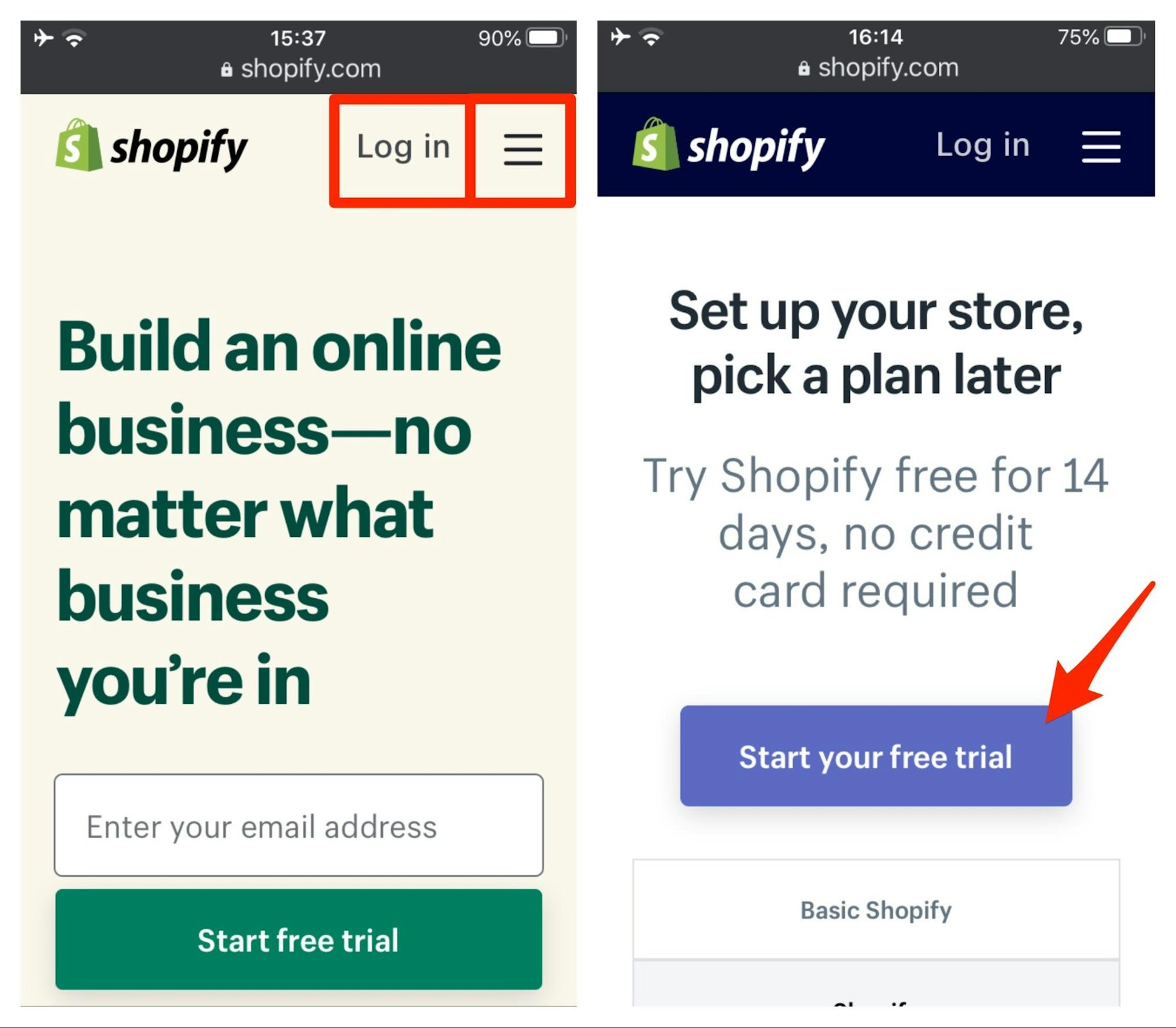
So, when you design your mobile responsive website, keep spacing in mind, and make sure that every hyperlink can be easily clicked.
2. Make the Text Large Enough to Read
This one might seem a little obvious, but it’s also crucial to mobile-friendly website design.
Users should never have to zoom in – or scroll left or right – to read something. The text should always be large enough to read comfortably.
In the example below from Beardbrand, you can see that all of the text on display perfectly fits the size of the screen.

Make your text large enough on screens of all sizes so users can easily read what you have to say.
3. Simplify Menus
Desktop website menus have a lot of space. They can take up an entire bar at the top of the screen, and have extensive drop-down options, all without hindering the user experience.
This isn’t the case on mobile devices – there just isn’t enough space.
Mobile-friendly websites should use simple menus that present an overview of the website. Users can then use categories, filters, or the search feature to hone in on what they’re looking for.
Most mobile-friendly websites use the hamburger symbol – consisting of two or three horizontal lines – to indicate a menu.
Let’s check out a good example from one of the best mobile websites, Kylie Skin.
When users tap the two-line hamburger menu in the top-right of the screen, they’ll be shown a full-screen menu with large buttons and text.
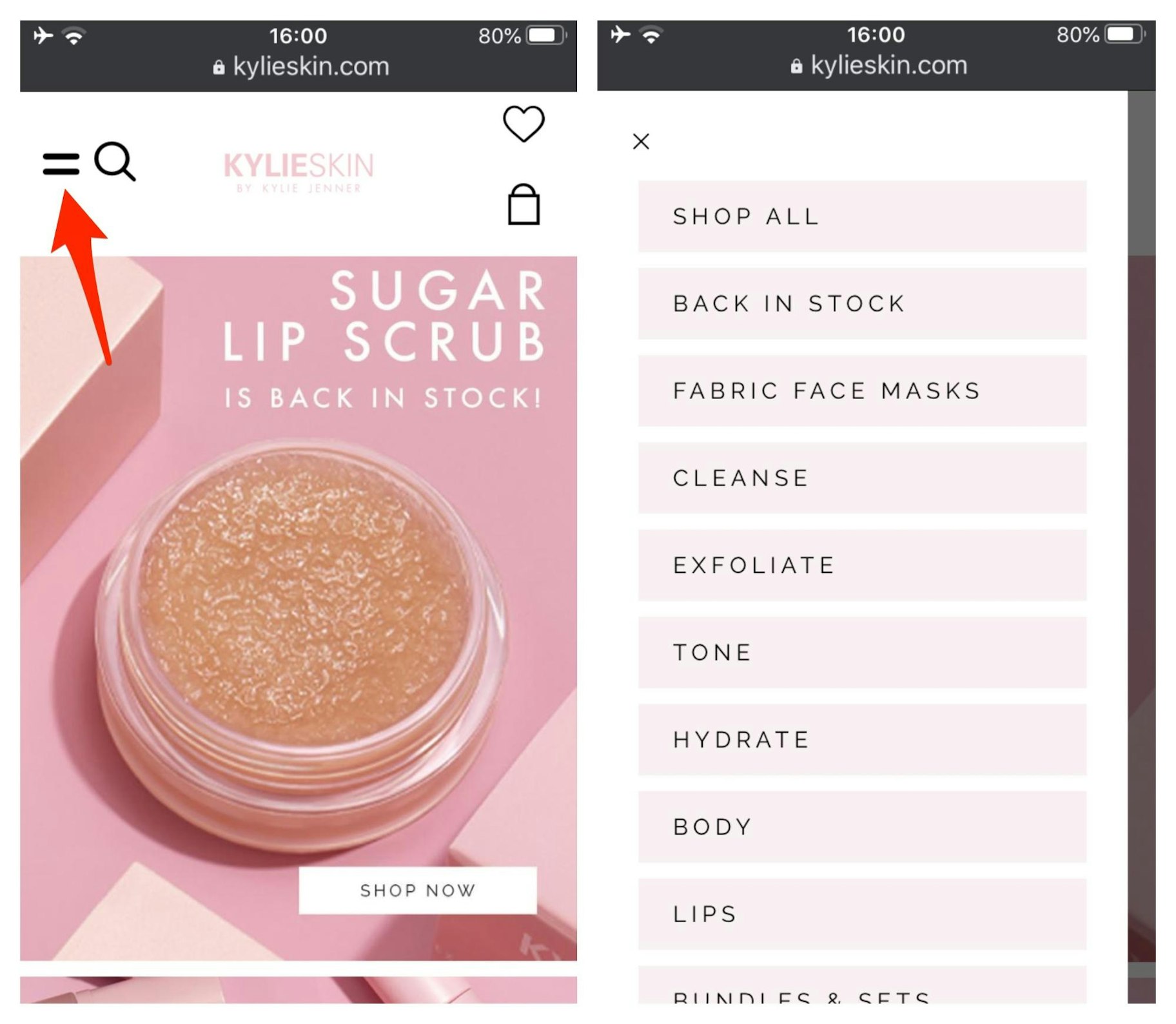
When creating a mobile responsive website, keep your menus simple to make it easy for users to find what they’re looking for.
4. Provide a Simple and Intuitive Search Feature
Your website’s search feature is especially important to mobile users.
As mentioned above, simplified menus can make mobile browsing easier. However, they can also make it more difficult for users to find a specific item.
To make it effortless for users to find what they want, place the search feature front-and-center.
Shopify user Gymshark places the search function in the top bar of the page. There’s also an intuitive filter function to make it easier for users to find specific types of products.
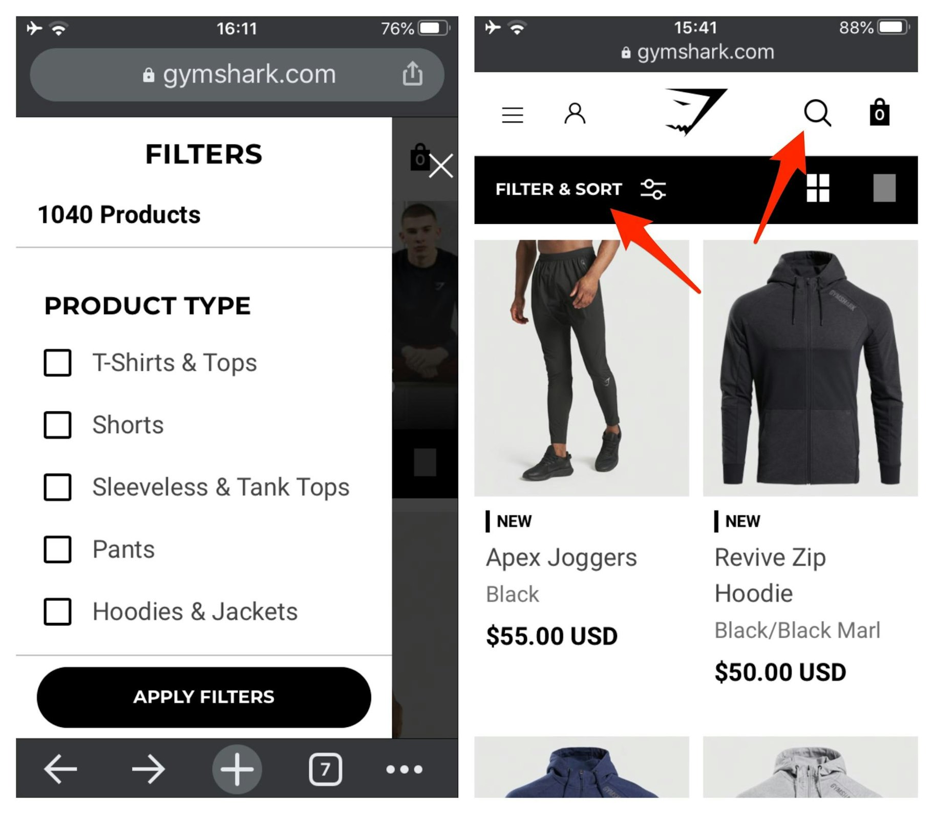
The key takeaway? Make a simple and effective search feature part of your mobile website design.
5. Make it Easy to Get in Touch
If a customer is looking for your contact details, they might have run into trouble – which means they’re likely already a little frustrated. Don’t add insult to injury by making it difficult to contact you.
Especially when 84 percent of consumers consider customer service to be a key factor when deciding whether to make a purchase.
Here’s another great mobile website design example from Shopify user Bremont. This luxury watch brand places a chat icon at the bottom-right of the screen, which makes it quick and easy for website visitors to contact a representative.
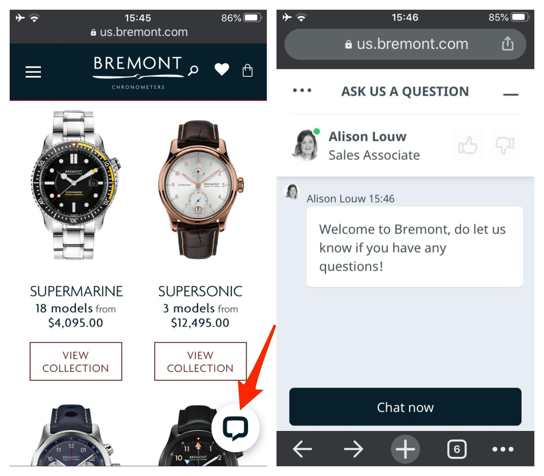
If you can’t offer live chat around the clock, consider linking to a Facebook chatbot, or simply provide a contact form that users can access via a “Contact” link in your menu.
6. Create Simple Forms
Users may be more inclined to fill out a long form on a computer because the screen is larger and it’s easier to type with a keyboard.
On mobile devices, forms need to be shorter with large text fields and buttons.
For example, if you’re asking users to sign up to your mailing list, you shouldn’t ask for more than a first name and email address.
If you need to include more questions, make them quick and easy to answer.
In this mobile website design example from Shopify user QuadLock, you can see large fields with simple form requirements. There’s even a drop-down menu to help users provide information about their inquiry.
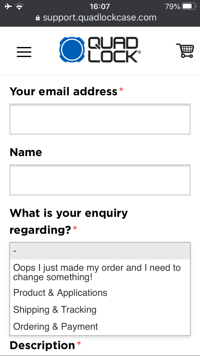
In short, make sure your forms are short and sweet.
7. Create Eye-Catching Calls-to-Action
A call-to-action – also known as a CTA – is an image, banner, or piece of text that literally calls users to take some form of action.
For example, you might prompt users to sign up to your mailing list, learn more about an offer, or purchase a product.
This marketing tactic plays an essential role in mobile website design.
However, it can be challenging to create compelling calls-to-action with such limited screen space to play with.
In this mobile website example from Shopify user Luxy Hair, you can see two banners featuring calls-to-action. The first one promotes a new product that comes with a free gift, and the second prompts users to learn more about the brand’s free shipping and 90-day exchange policies.

When creating CTAs for your mobile-friendly website, make them stand out by placing them above the fold where users can see them without having to scroll down.
8. Avoid Pop-Ups
Let’s face it: Most people hate pop-ups. In fact, if you Google “I hate pop-up ads,” you’ll find almost 48 million results.
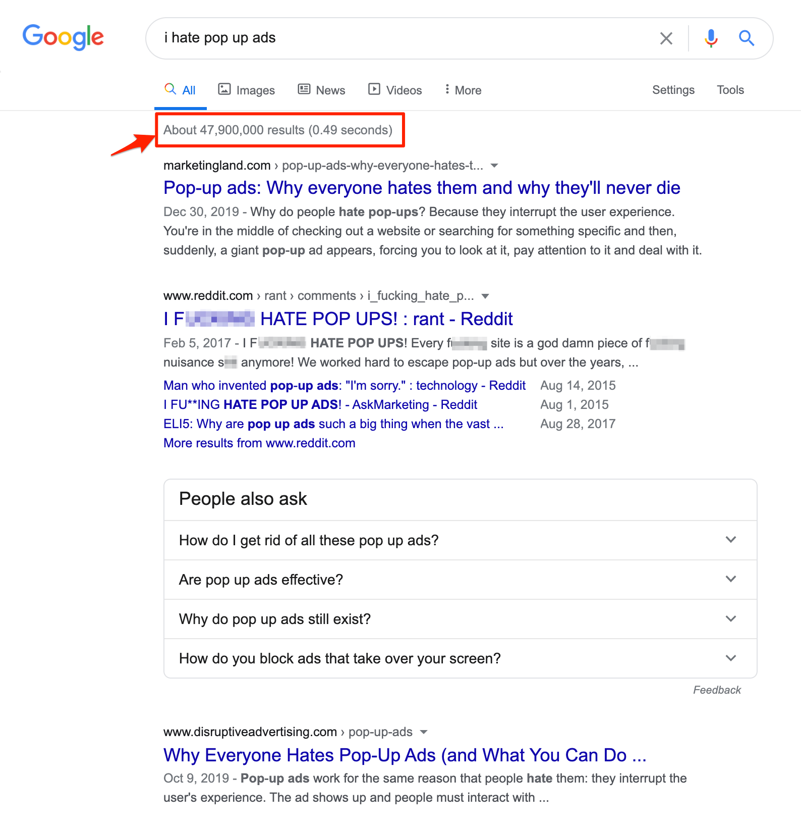
No wonder Google rolled out an algorithm change in 2017 that penalizes websites that serve specific types of pop-ups on mobile devices.
These days, your search rankings are likely to suffer if you:
- Show a pop-up that covers the main content
- Display a standalone interstitial that the user has to dismiss before they can access the main content.
- Make the top of the page resemble a standalone interstitial and place the original content underneath.
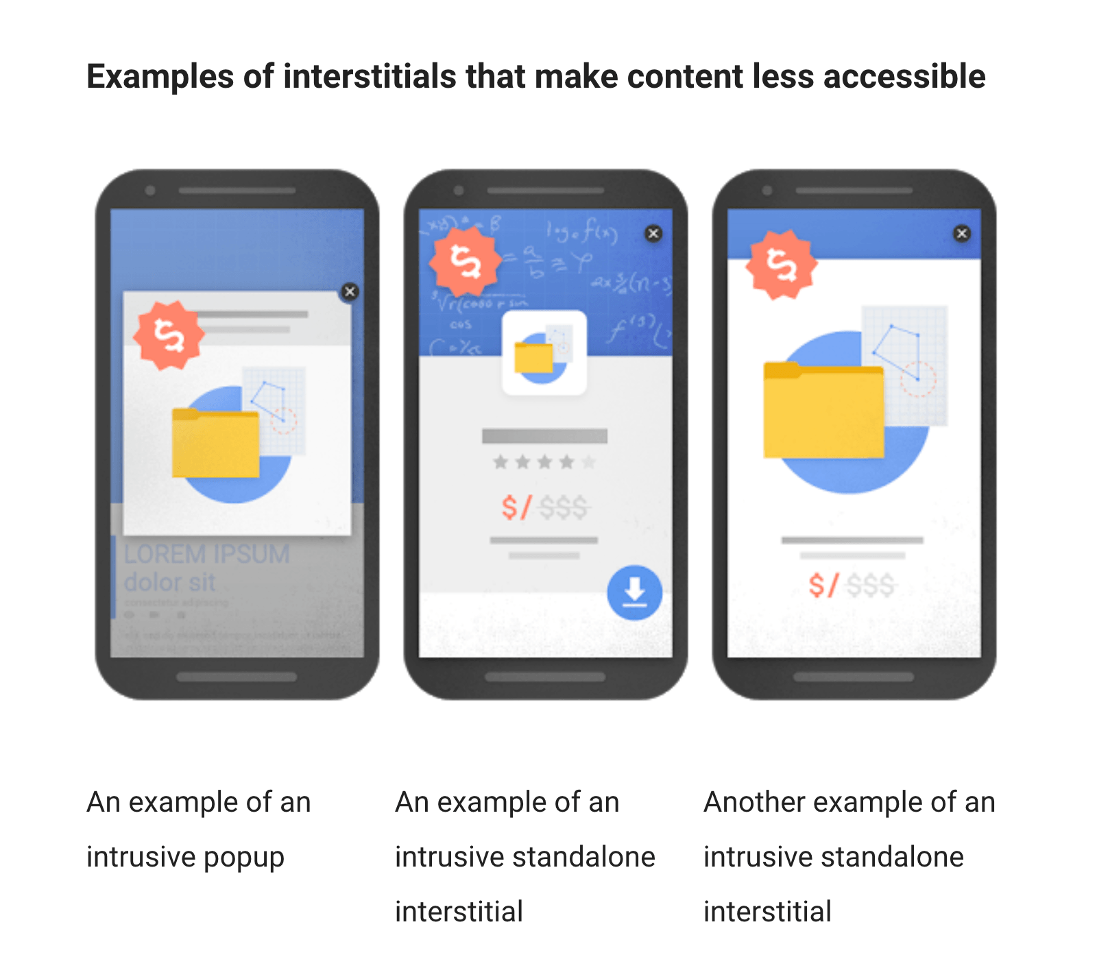
That said, some types of pop-ups shouldn’t affect your rankings negatively, such as
- Interstitials used to meet legal obligations such as age verification, cookie consent, or GDPR.
- Login windows to access private content, such as email or content that is behind a paywall.
- Small banners that are easily dismissable and “use a reasonable amount of screen space,” such as the app install banners used by Chrome and Safari.
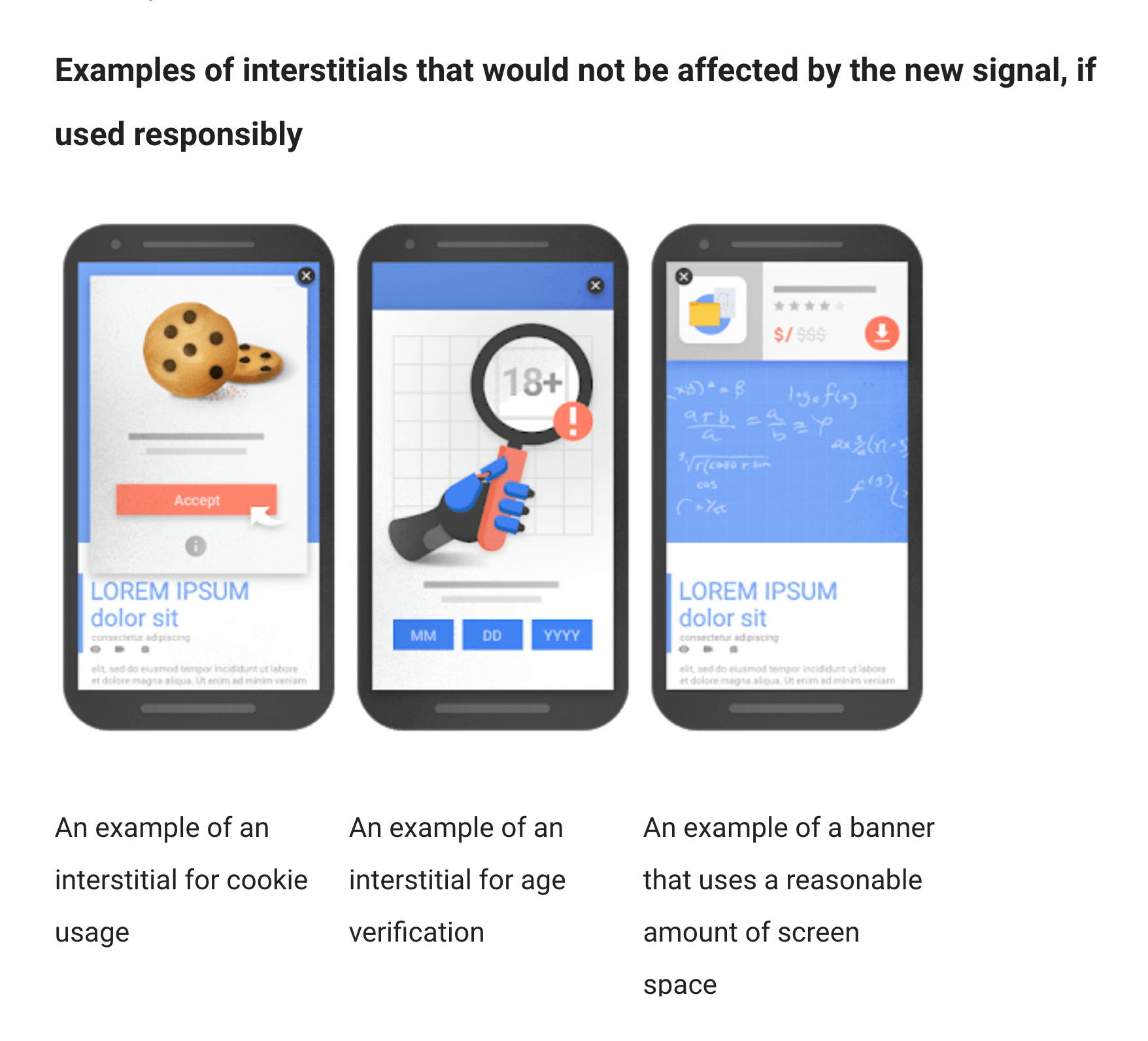
Bottom line, mobile pop-ups frustrate users and can hurt your search rankings, so only use them when absolutely necessary.
How to Find Out If You Have a Mobile-Friendly Website
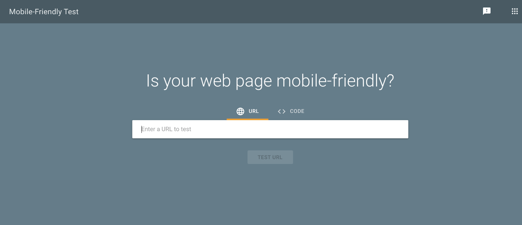
If you’re wondering whether your website is mobile-friendly, it’ll only take a moment to find out with Google’s mobile-friendly test tool – just input a link to your website and click “Test URL.”
This tool will evaluate how mobile-friendly your website is and give you a detailed breakdown of what you can do to improve it.
Summary: Mobile Website Design in 2023
A mobile-friendly website is one that is designed to work well on smartphones and tablets. And now that the world is mobile-first, your website should be too.
In summary, here are eight mobile website design tips:
- Make buttons big enough for people to tap them.
- Ensure that text is large enough to read without users needing to zoom in.
- Simplify your menu to make it easy to navigate on a small screen.
- Place the search feature front-and-center and allow users to filter search results.
- Make it effortless for users to contact you.
- Create forms that are simple and quick to use.
- Place calls-to-action above the fold, so that they’re prominent.
- Avoid frustrating users with pop-ups unless they’re absolutely necessary.
What are your thoughts on mobile website design? Have we missed any great mobile web design best practices? Let us know in the comments below!
