The About Us page is one of the first and most important pages to build on an ecommerce website.
It’s a page that explains who you are, what you do, and what customers can expect from your brand.
For ecommerce businesses in particular, the About Us page should be anything but a placeholder. This critical section should be a place to answer pressing questions, a catch-all for recent highlights, and a space to explain company goals, mission, and overall impact.
Let’s explore 10 tips for constructing a successful About Us page, followed by some great examples from other websites in the ecommerce industry.


What is an About Us page?
The About Us page is exactly what it sounds like: a space where you share details about you and your business. It’s where you talk about your beginnings, beliefs, and the path that led you to where you are now. This page is a chance for companies to build a connection with customers by showing what stands behind the brand.
Research by Shopify found that customers often visit the About Us page to get to know the brand better and see the people behind the products. Make sure your About Us page answers these curiosities to help them make buying decisions.
→ Click Here to Launch Your Online Business with Shopify
Customers also look at an About Us to understand a company’s mission. They use it to check if a business’s core values match their own, which can influence their choice to shop with you.
Elements of an About Us page
Compared to a landing page, your About Us page should focus more on your brand’s identity than on sales. Here are some elements to include:
- Your brand story. Share your company’s origin story. What drove you to start? Make this story personal so customers feel connected to your brand.
- Target audience. Who are your products for? What needs do they meet? Show customers the value of what you offer and how it helps them.
- Operational insights. How does your business run? What unique methods do you use? Share these details to build trust and set your brand apart.
- Social proof. Have customers praised your products? Received awards or recognition? Use testimonials and accolades to authenticate claims and show value to future clients.
- Call to action. What should customers do next? Should they sign up for a newsletter or follow you on social media? Direct them clearly to engage further with your brand.
Your About Us page should reflect your unique story, yet it’s perfectly fine to draw inspiration from others, particularly in terms of structure and design.
10 tips for creating a successful ecommerce About Us page

The About Us page will be one of the most popular pages on your website. Besides curious visitors, the page will be visited by media professionals, leads, and potential brand partners. As such, it’s important to get it right.
Following are some best practices for creating a unique About Us page.
1. Make it look and sound like your brand
An About Us page should reflect your brand’s personality. This means aligning all copy, images, and other elements with your brand guidelines.
It may be helpful to run your copy through TTSReader to find broken sentences or off-brand content. Otherwise, don’t be afraid to cut anything that just doesn’t work.
2. Don’t neglect your SEO
This means including relevant keywords about your brand and what it does. You can turn to tools like Ahrefs for this, or even Google Analytics.
Just make sure not to keyword stuff, which could negatively affect your SEO rankings.
3. Add diverse media
Text is not enough for the average About Us page. To genuinely capture your visitors’ attention, you need to include variety in your page design. For most ecommerce companies, using a combination of pictures, videos, graphics, and animations is a good starting point.
4. Write for the search intent
When users type your brand into the search bar, what are they looking for? While you can’t always know for certain, you can rise to the challenge by writing for the search intent.
Start by weaving in basic facts about your business, including the year established, products offered, and business type. From there, expand into other relevant categories such as brand affiliations and company news.
5. Provide internal links
Internal links are critical for helping visitors find what they’re looking for.
Link your About Us page to individual products, categories, or pages for trending items.
6. Beef up the length
About Us pages shouldn’t just fill up space. However, densely packed pages can decrease bounce rates and improve visitors’ connection to your brand.
Many ecommerce companies create About Us pages that explore their history, products, and even influencers. Some of the largest stores include a list of charities, beliefs on sustainability, or even opt-in forms for weekly deals.
7. Add some FAQs
If you don’t already have an FAQ section of your website, try adding it to your About page.
This is helpful for two reasons. First, visitors can answer all their questions in one convenient location. Second, your page will likely match the user’s search intent.
8. Highlight important stats
The About Us page isn’t just about your brand’s accomplishments. Highlighting your biggest achievements is always beneficial. You won’t just be impressing your customers—you’ll show the world how powerful your brand has become.
Try starting with hard numbers such as customers served, transactions made, or products sold. You might also want to include industry-specific stats, such as your sustainability measures and their impact.
9. Add a call to action (CTA)
CTAs have a place on every web page—and the About Us page is no exception.
Simple buttons like Shop Now or Browse Catalog are a great place to start.
10. Talk about the product
Your brand’s history and achievements are only part of an About Us page. It’s important to include your unique selling proposition, particularly if your products are one of a kind.
You may want to provide an infographic that breaks down your products’ ingredients, materials, or structure. If possible, add a section that discusses each type of product your company offers (with inbound links to each).
13 About Us page examples
No two About Us pages are alike. However, the elements they include will share some similarities in terms of structure and function.
Whether you’re using a webpage generator or building a page from scratch, it pays to follow great About Us page examples while building your first layout.
This includes the examples provided by these top companies:
- Colourpop
- Fashion Nova
- Gymshark
- Fan Gamer
- G FUEL
- Allbirds
- Iya Foods
- Future Kind
- Wild Fork
- Bossy Cosmetics
- Milky Bar
- MVMT
- Bird
1. Colourpop
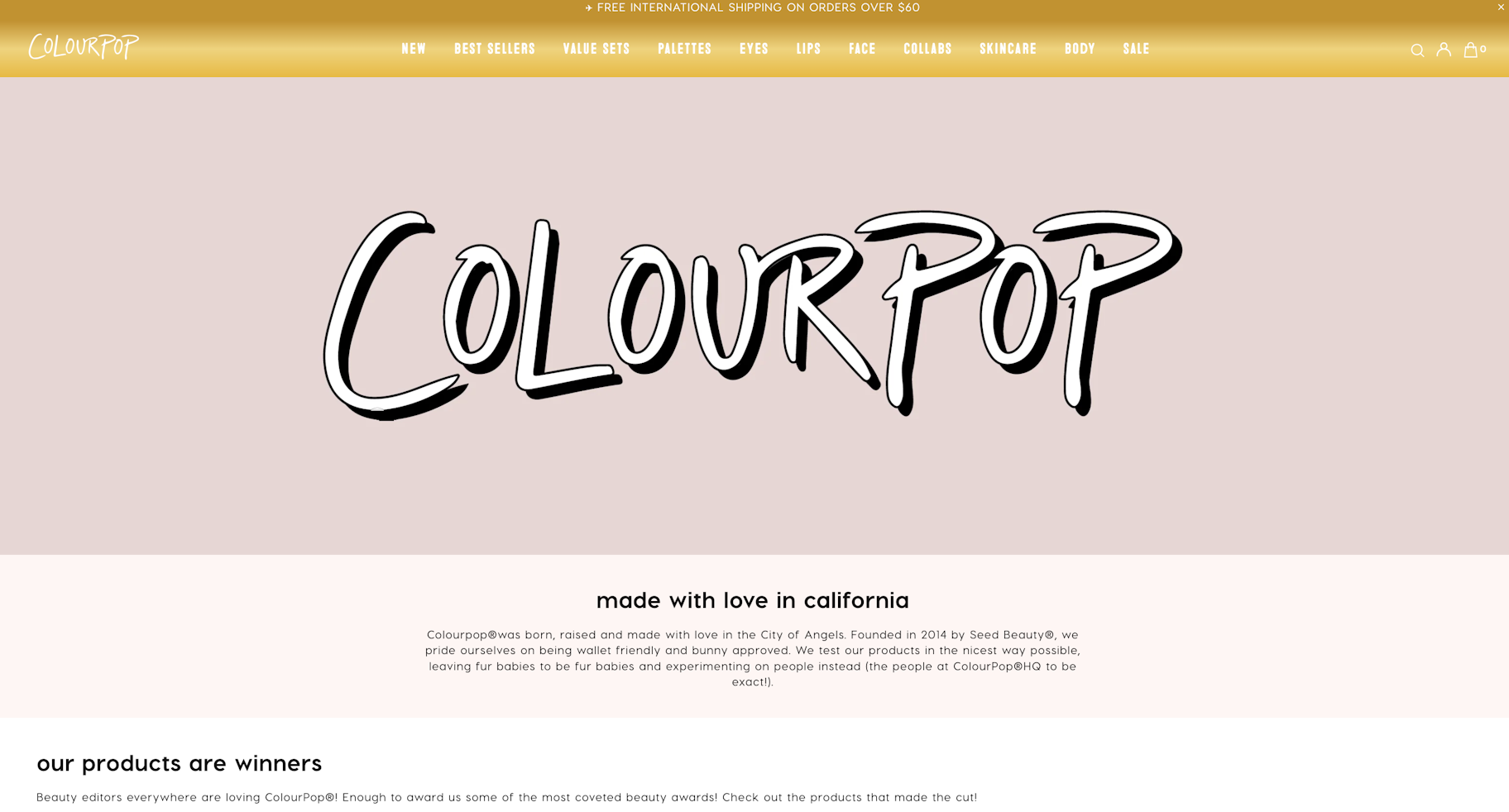
Cosmetics brand Colourpop is all about transparency—something that’s immediately reflected on its About page.
The page begins with a Word Art–esque graphic,followed by a story of the company’s foundation. Notice that the content stays on brand even while discussing serious topics.
From here, the content seamlessly transitions to recent awards, then merges with some reviews and testimonials. This is the website’s biggest strength: building a connection to customers from a first-, second-, and third-person perspective.
The bottom of the page links to each of the company’s product segments, then ends with a clear CTA to sign up for its newsletter. This is a great example of how all elements of the About Us page should point toward the same objective: netting more sales.
2. Fashion Nova
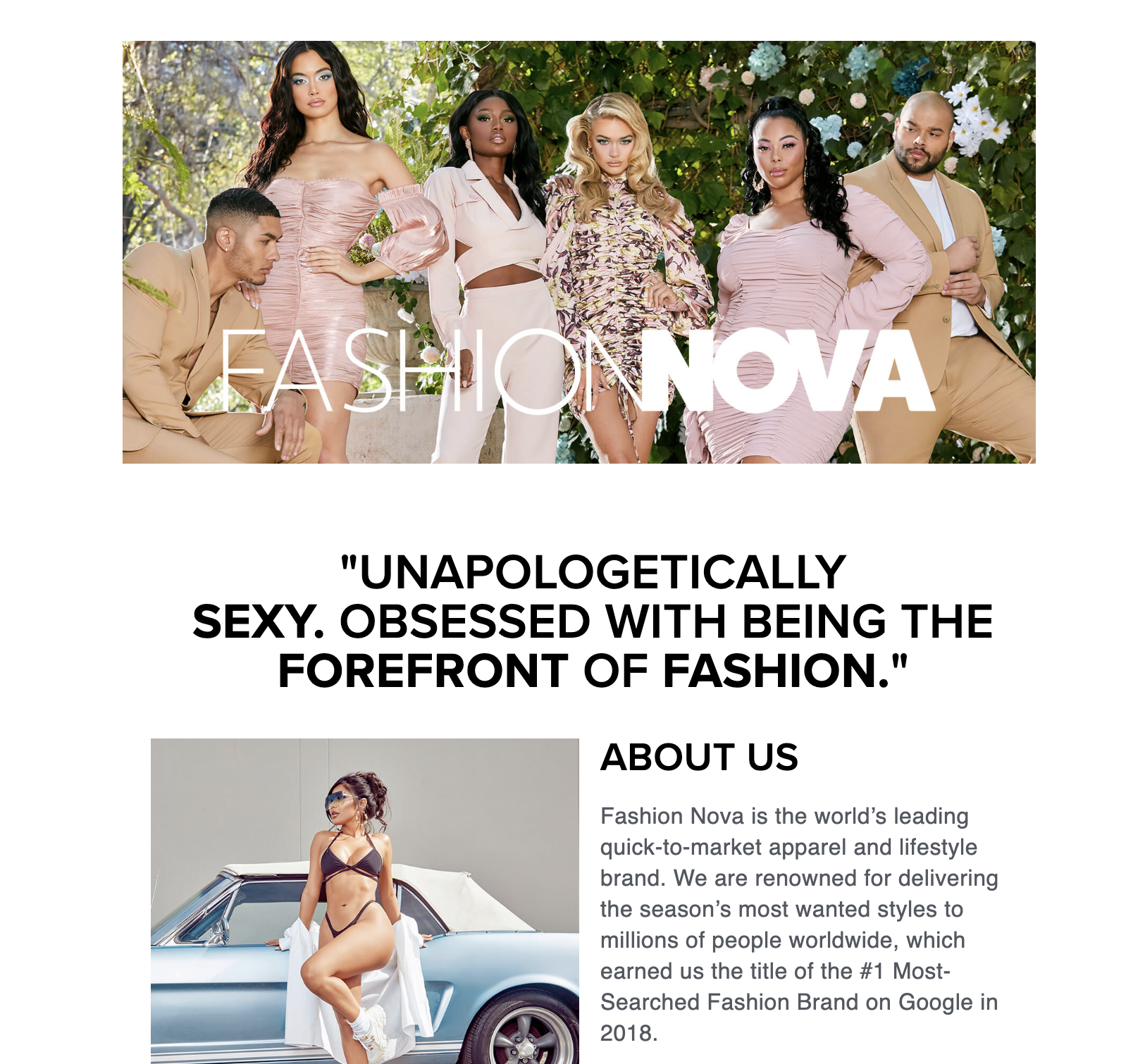
As a cutting-edge fashion brand loved by millions, Fashion Nova begins its About Us page with a simple idea:
“UNAPOLOGETICALLY SEXY. OBSESSED WITH BEING THE FOREFRONT OF FASHION.”
There are clear sections for each major idea—brand history, brand mission, and brand story. Although these are based largely on text, you’ll notice that a few images are inserted before every new idea.
The punchy finish here is an interesting one. The company adds a detailed section regarding its influencer community and provides a button prompting visitors to follow Fashion Nova on Instagram.
This shows that an About page’s CTA doesn’t have to be Buy Now.
3. Gymshark
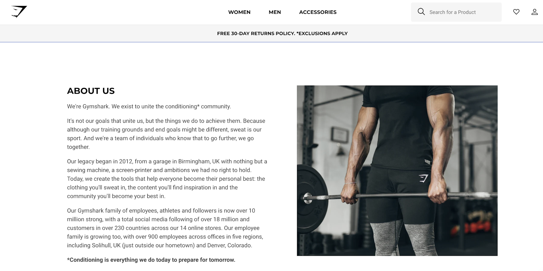
The Gymshark About Us page has three major sections: the story, the company values, and links for media inquiries.
The company’s story takes a moment to acknowledge its leadership team, which allows visitors to familiarize themselves with the human aspect of the brand and its mission.
This is a great reminder, even if you’re a company of one. Putting a face to your ecommerce brand can be a great way to foster human connection.
4. Fan Gamer
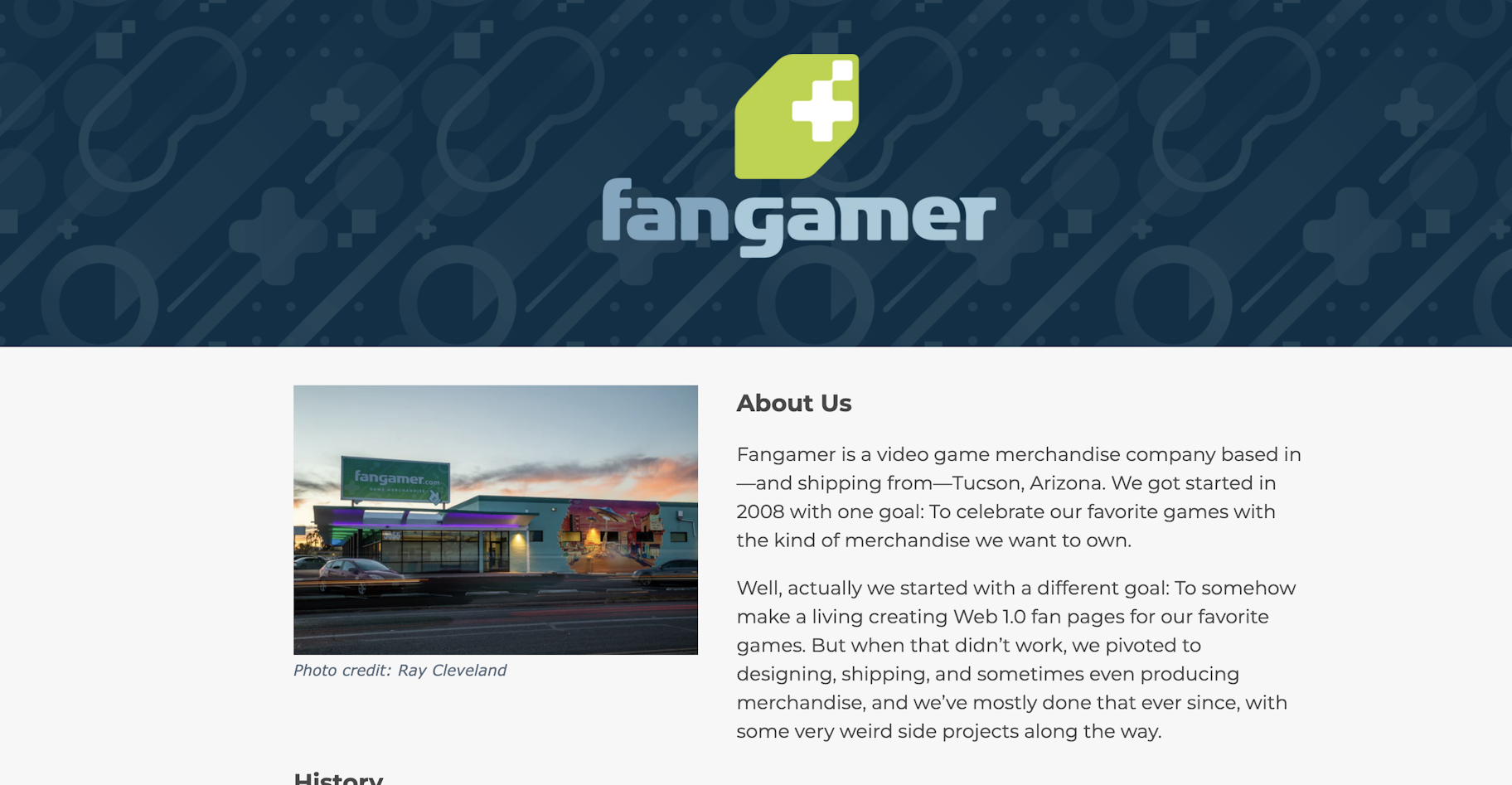
Fan Gamer is a site for fans, by fans. Its About page specifically references video games and pop culture references that its audience would recognize. This builds a great rapport with visitors and really shows off its brand voice.
Although the page is mostly text-based, Fan Gamer uses a variety of in-page links to direct shoppers to the right location. It appears very intent-focused without being overwhelming, which helps interested visitors continue their buyers journey without friction.
Fan Gamer reminds us that we don’t need to be fancy or splashy to make a good impression, especially if you know your target audience.
5. G FUEL
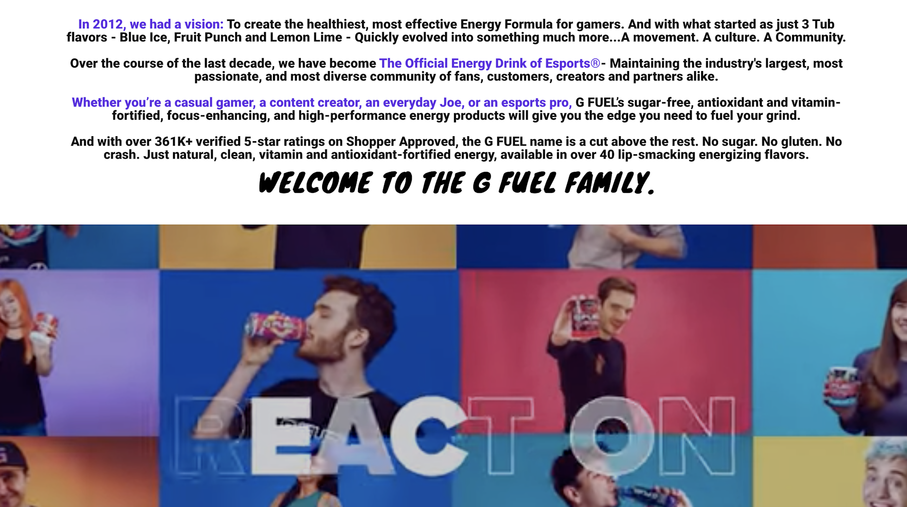
G FUEL’s About Us page is extremely eclectic. A static image announces its position as the official energy drink of eSports, which is promptly followed by an introductory video.
The text-based portion of G FUEL is small—in a good way. As its main audience consists of gamers and visually driven customers, the decision to opt for a shorter page is ingenious. And since visuals are 60,000 times more powerful than text, it’s simple, accessible, and cost-effective.
To know thy audience is to know thyself. G FUEL does an exceptional job of both.
6. Allbirds
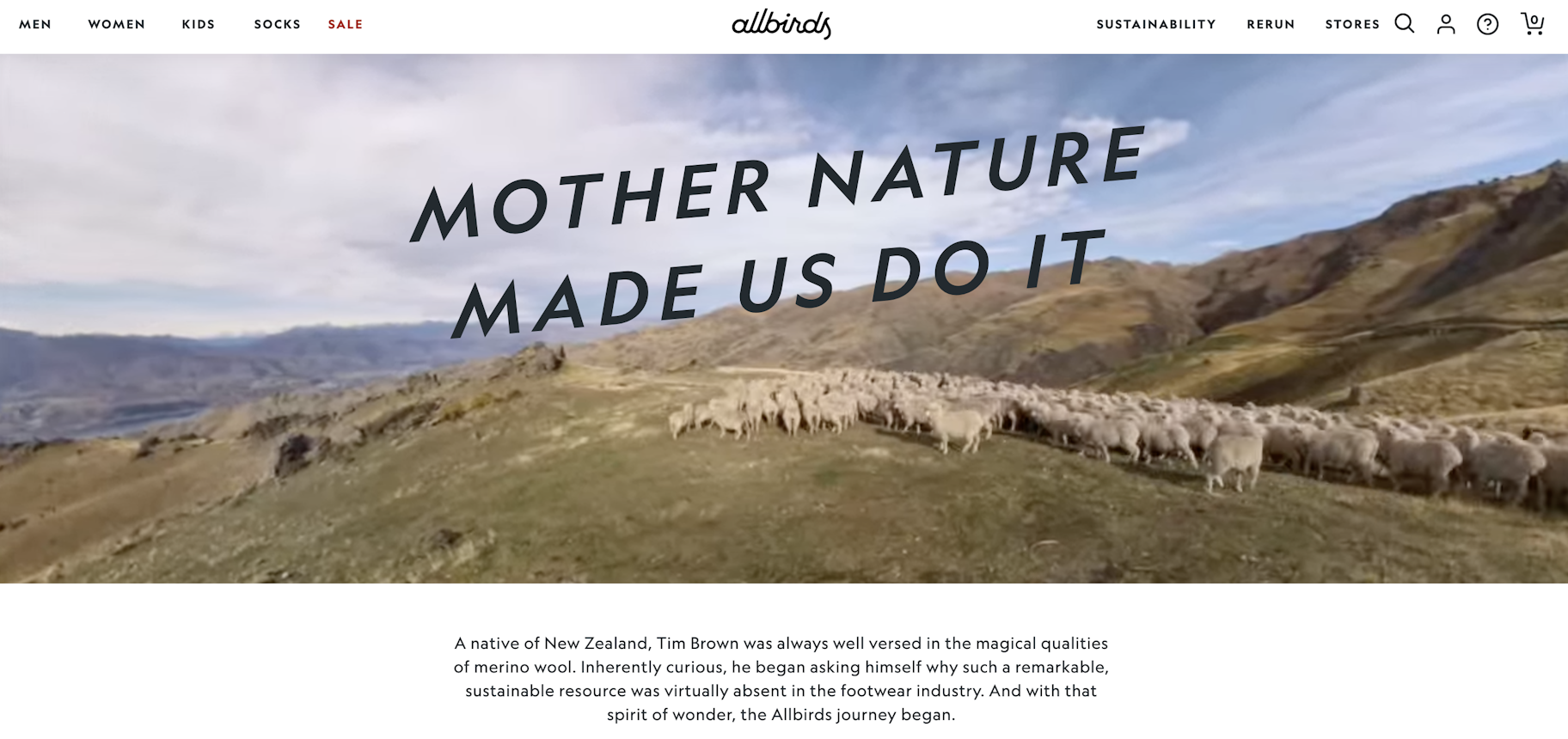
Sustainable shoe company Allbirds puts a heavy emphasis on its commitment to Mother Nature. Its About Us page is both informative and memorable, providing detailed information about what the company does and how it began.
To double down on its USP, Allbirds includes a full animation of their project at the bottom of the page. This breaks down the most important elements of their shoes, including their design, comfort, and cash-back guarantee.
Ecommerce companies would do well to follow a similar strategy regardless of their vertical. Add animations and include topical bullet points that reinforce your unique selling proposition.
7. Iya Foods
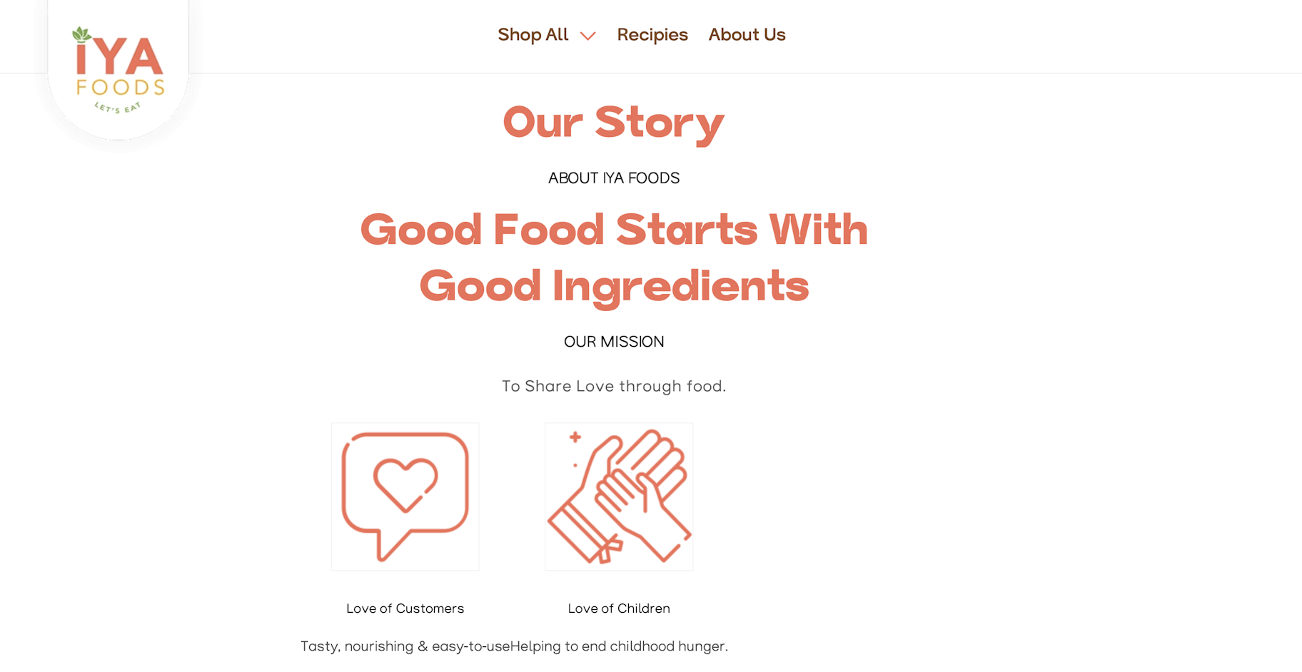
Starting with flavor, ending with love—that’s the essence of Iya Foods. It clearly explains what it does and the mission it’s on right from the start: “To share love through food.”
Iya Foods displays its mission with vivid photos of ingredients. This brand cares deeply about its global impact, a point it emphasizes in its mission statement. Sharing your brand values and what you stand for is a powerful way to connect with your audience.
It doesn’t need to be boring. however. Add elements that highlight what makes your brand special.
Iya Foods uses images, social media links, and mentions in well-known publications to boost its credibility.
8. Future Kind

Future Kind’s About Us page opens with the brand’s story. Two Aussie brothers, Shaun and Eliot, couldn’t find the vegan supplements they were looking for. So, they rolled up their sleeves and created their own.
They spell out what sets them apart: clean, organic ingredients, a commitment to sustainable practices, and strictly vegan, cruelty-free products.
They also detail why buying directly from them is more beneficial than through retailers. Typical supplements like omega-3s, vitamin D3, and collagen often originate from animal sources such as fish, sheep wool, and cow parts. Future Kind’s versions, however, are derived from sustainable, plant-based sources.
To finish, the brand displays its full range of supplements with a clear call to action to Shop All. This invites visitors who connect with its mission and trust its products to easily start shopping.
9. Wild Fork
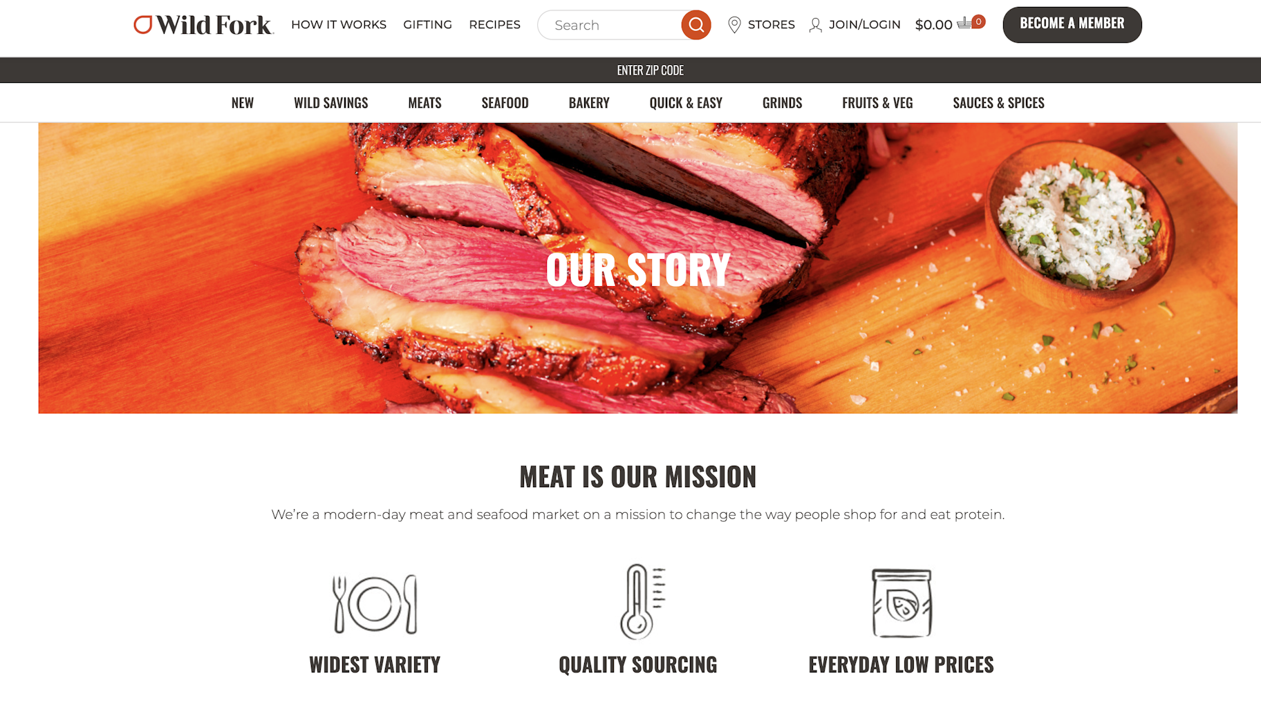
Wild Fork’s About Us page makes a positive impression right from the start. It clearly outlines the benefits of its products—highlighting convenience, variety, and freshness. It also shows off the best cuts of meat through vivid pictures.
The page includes a captioned video that explains Wild Fork’s process and visual infographics that trace the meat’s journey from farm to fork.
Beyond just tasty meat, Wild Fork offers peace of mind to those looking for healthy meat alternatives. This combination of visuals and information helps anyone understand why its approach is special.
10. Bossy Cosmetics
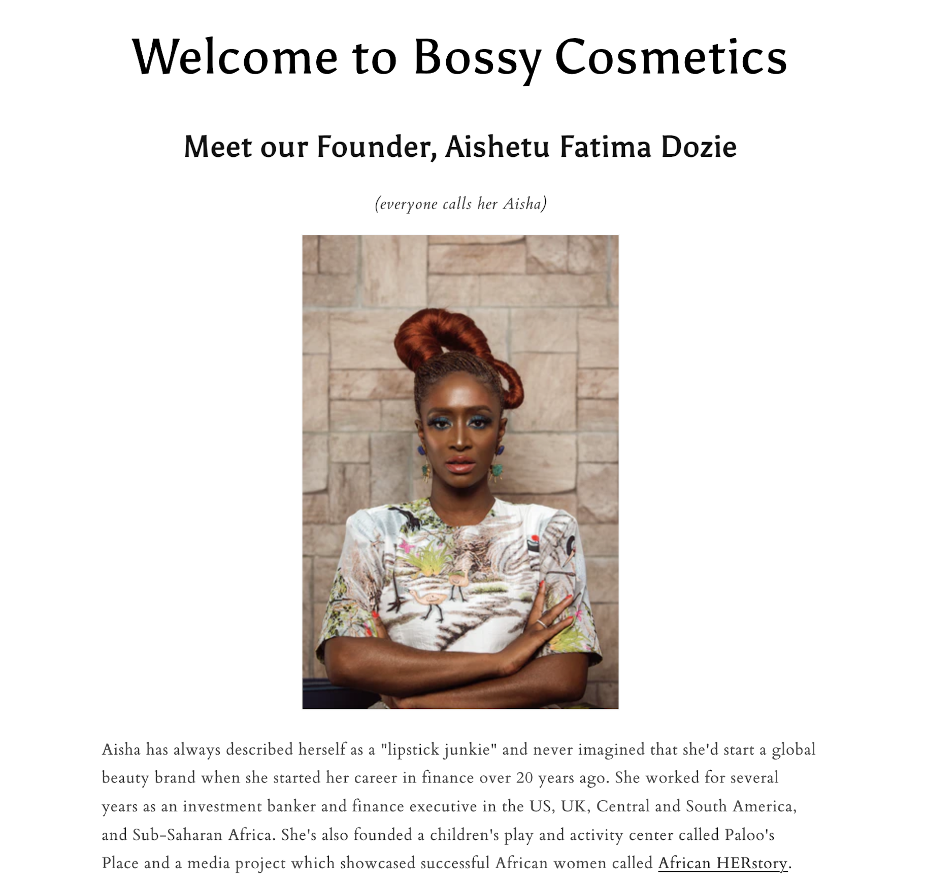
This About Us page example keeps it classic with lots of text. But what’s most noticeable is its placement of the brand’s founder upfront.
The founder shapes the brand’s roots, so placing her at the forefront makes sense. Consider beefing up your About Us page, like Bossy does, with additional elements such as:
- Snaps of happy customers using your goods
- Brand-related TikTok reels
- Interactive timelines showcasing milestones
- A friendly YouTube welcome
- Links to charitable partners and brands
When crafting your About page, don’t sacrifice creativity for professionalism, especially if it’s not your brand’s vibe. What counts is connecting with your audience on their level and ensuring your story resonates authentically.
11. Milky Bar
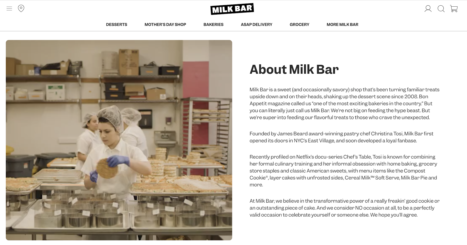
Do you create your own products? Why not give visitors an insider’s view of your production process? Your About Us page is the ideal place to do this.
After introducing your brand, take visitors on a visual journey via compelling images and behind-the-scenes footage of your production methods, much like Milky Bar does:
But don’t forget the other elements of an effective About Us page. For example, Milk Bar also includes:
- A brief overview of its origins and team members
- Social proof, such as being featured in prestigious publications
- Charitable partnerships and initiatives
12. MVMT
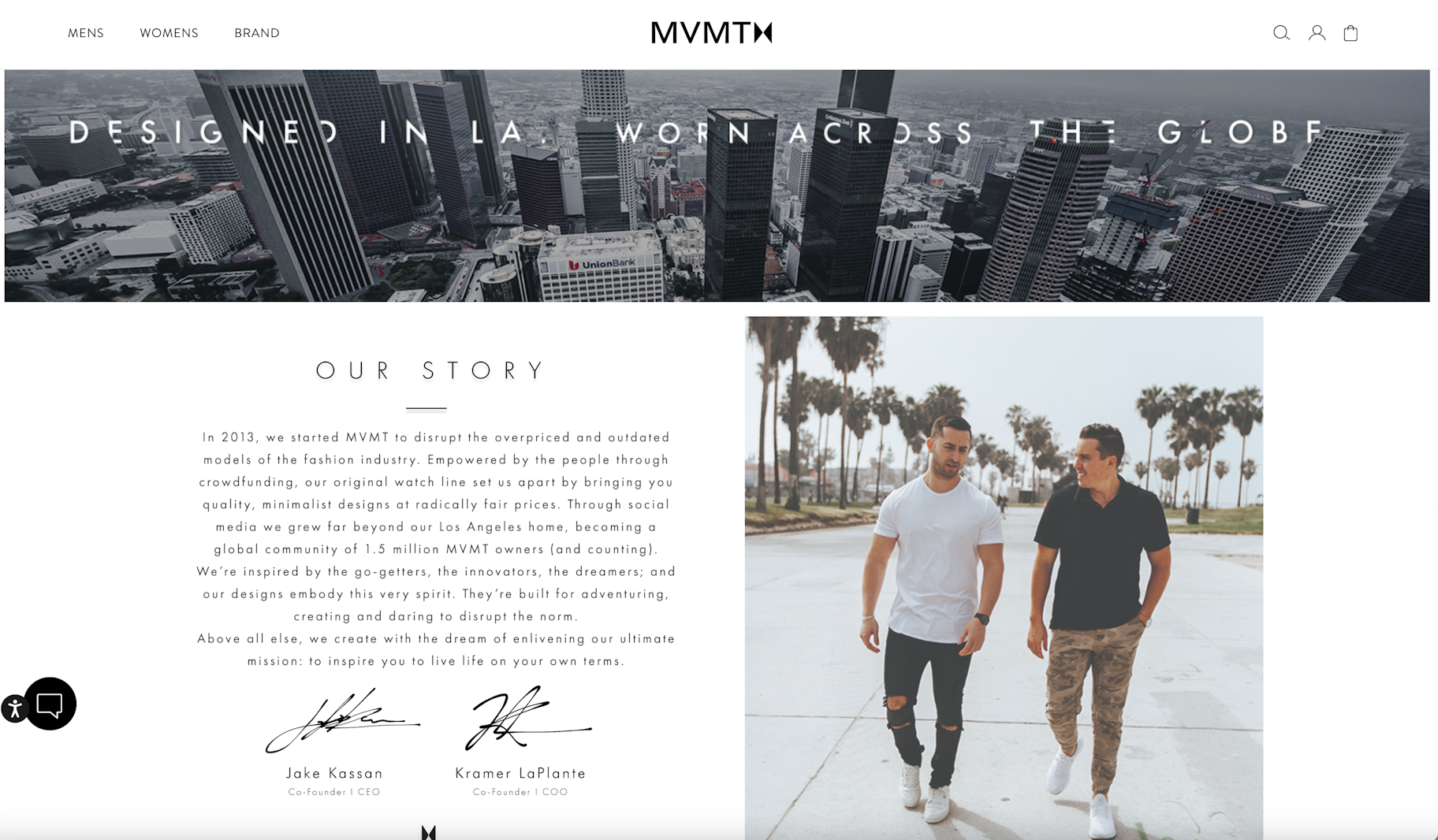
MVMT’s About Us page leads readers through its story using sections.
It starts with a story about the company’s two co-founders who dropped out of college. Photos show who they are before discussing their product promise and company philosophy.
After the introduction, the page covers other sections, like the brand’s products, mission, and social impact.
If you’re unsure how to structure your About Us page, take inspiration from MVMT and see the magic happen.
13. Bird
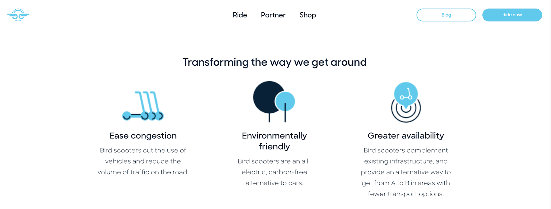
Bird’s About Us page centers on three core values:
- Easing congestion
- Promoting environmental sustainability
- Improving accessibility
The company outlines these values with unique icons, each corresponding to a pillar of the company.
Using iconography is an effective strategy. Distinct icons can be memorable and help break down the text into bite-sized ideas.
Implementing new features on your About Us page
Learning about best practices is all well and good, but when it comes to seeing success on your About Us page, you need to start implementing changes immediately.
If you already have an About page, do what you can to modify the content in light of these tips. While you can’t and shouldn’t change your style to reflect everyone else’s, at least try to update anything that might fall outside best practices.
If you don’t already have an About Us page, now is a great time to create one. Remember to build each section out slowly and begin with just one element at a time.
In either case, the work you put into your About Us page today will pay dividends tomorrow. Start treating it like a valuable asset to see real value from your efforts.
About Us page FAQ
Why do websites have About Us content?
Although your website can function without an About Us page, it’s definitely worth including. About Us content allows customers to learn who you are and builds trust in your brand. When customers feel a connection to your story and values, they are more likely to buy your products.
How to add an About Us page in Shopify?
First, log in to your Shopify admin dashboard. From the left-hand menu, select Online Store. Then click Add Page. Here, you can create your content and name the page About. After saving, add this page to your menu.
How do I write an About Us page?
- Introduce your team and describe your typical business activities.
- Highlight the key points that motivated you to start the business.
- Discuss the solution you developed and any obstacles you encountered.
- Share the major milestones your business has achieved.
- Detail your future plans or articulate your company’s mission and goals.
