Your product page is one of the most important pages on your website. So it’s only natural that you’d want to create a great product page.
Good product pages help convert browsers into buyers. Also, they help give your customers the information they need to make an informed purchase.
There are many ways to build ecommerce product pages. In this article, we’ll share some best practices for product page design that you can use to improve your own pages .
You’ll also see examples of different product pages so you can better understand what works well and what doesn’t.
Let's jump in.

Product Page Design: 8 Tips for Ecommerce Entrepreneurs
Your product pages can make or break your ecommerce business. So it’s crucial to design them well. Below are all the elements you need to include in your product pages design to make them more inviting for online shoppers.
The Perfect Product Description
According to Nielsen Norman Group, the most effective product descriptions are scannable, concise, and objective. This type of content was shown to improve usability by 124%.
To create scannable content, you should include short bullet points in your product descriptions for easy reading. Concise content is 1-4 sentences describing the product. Objective content describes the product honestly rather than exaggerating benefits.
→ Click Here to Launch Your Online Business with Shopify
In the example below, there’s too much unnecessary information. Also, as colors and sizes run out of inventory, you’d have to keep manually changing the product descriptions for all products accordingly.
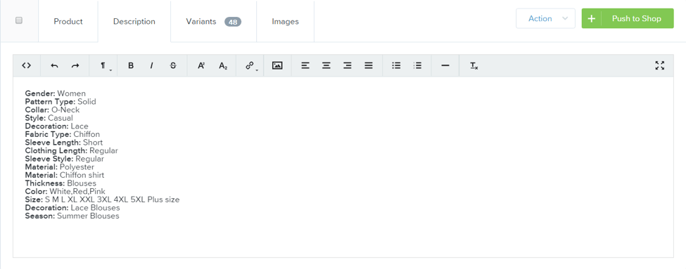
In the next example, there are three sentences. The first sentence describes the product in a neutral way using some of the bullet points supplied by the dropshipper. Feminine replaced the ‘Gender: Women’ point. Next, two sentences were written to describe outfit pairings. This allows the potential customer to envision an outfit for the blouse they’re looking at.
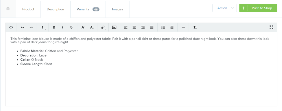
Like the second example, you can choose to remove several bullet points if they seem redundant. Also, if you want to create a consistent brand you might choose to organize all product page bullet points in the same way. In fashion, you might always have the fabric first and so forth.
The Perfect Product Images
The best product pages feature high quality images showcasing the products in all their glory. You should never compromise on image quality as it can have a negative impact on your sales. If a picture is low quality or doesn’t represent the product well, consumers aren’t going to move forward with the purchase.
People want a clear idea of what the product might look like in real life. Learning product photography can help you capture images that shoppers envision their appearance.
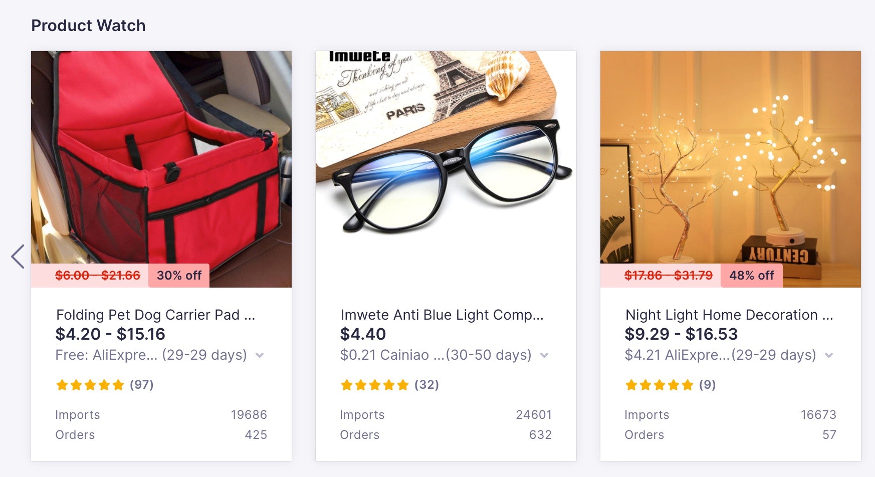
You should also note that some product sourcing platforms allow you to import product images. For example, you can import item images from Spocket to use on your product pages. Once imported, make sure to remove logos from product images in PhotoShop. If your product was shot on a grey background, remove the background to make it white. Try to create a consistent look for the products on your website.
Next, consider including 360-degree images in your product page designs to enhance the visitor experience. Customers enjoy being able to see all angles of a product. For example, knowing what the front and back of a top looks like helps customers see what they’re buying.
It’s also great to allow customers to add their own product images in the review section. It allows everyone to see what they’ll get without the glitz and glam of professional photography.
Also, if you sell fashion items such as dresses or shirts, don’t forget to import a size chart image. This allows customers to see measurements and sizes to help them decide on which is the best fit. If you’re sourcing from Asia and selling in the US, use our guide to convert Asian sizes to US sizes.
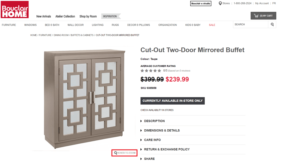
In addition, having a product image zoom feature allows customers to get a better view of your product image. It allows your customers to look at a product’s fine details.
Lastly, having a product video can increase conversion rates. According to Kissmetrics, site visitors are 64-85% more likely to buy after watching a video on a website.
A Sense of Urgency
According to Conversion XL, you can increase sales by as much as 332% by creating scarcity and a sense of urgency. You can also increase your conversion rate by doing this.
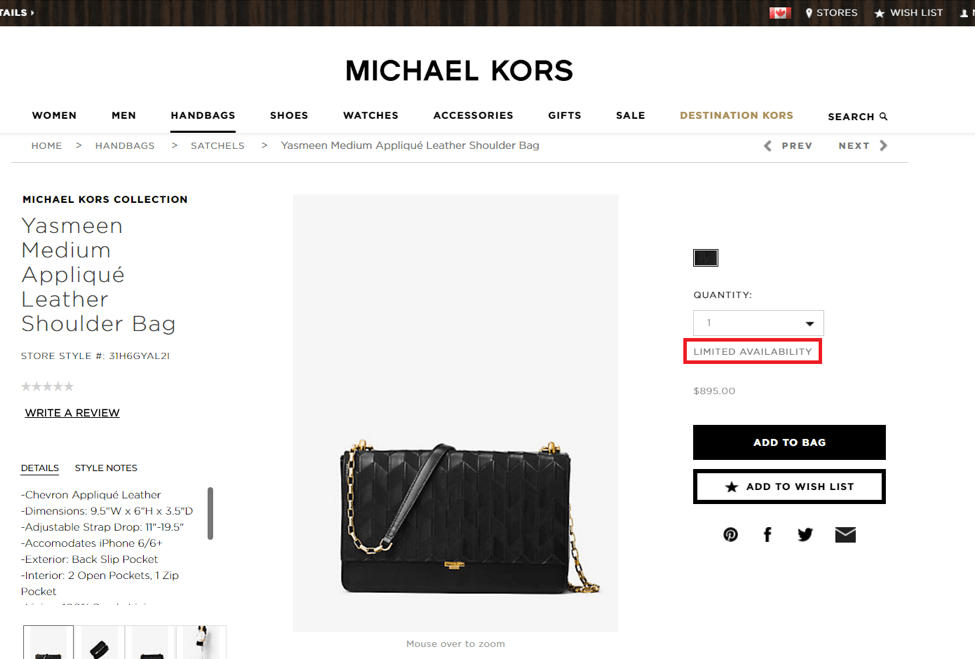
Urgency helps turn the casual browser into a buyer, fast. When your customers browse your store, a great product will seduce the browser. However, having a sale countdown timer can help encourage the browser to buy right now.
Using countdown timer apps like Hurrify can help create a sense of urgency. You can write your own text or choose from a list of examples. Having text that indicates limited quantities can help create scarcity which may help drive sales. However, you can choose to test various different texts to see which increases conversions the most.
Intuitive Layout
Your customer should be able to know how to use your website even if they don’t understand the language. There’s a general product page layout that your online store should integrate. Don’t use funky, impractical layouts as it can confuse customers or frustrate them. Keep it simple.
Most of the time, the product image is on the left. The product copy is on the right with the Add to Cart button close by and prominent. Make sure your ‘Add to Cart’ button can be clearly seen.
When choosing a theme for your store, you should make sure it looks similar to other popular websites in your niche. While many will say ‘stand out from the competition,’ this is generally bad advice when it comes to product page layouts.
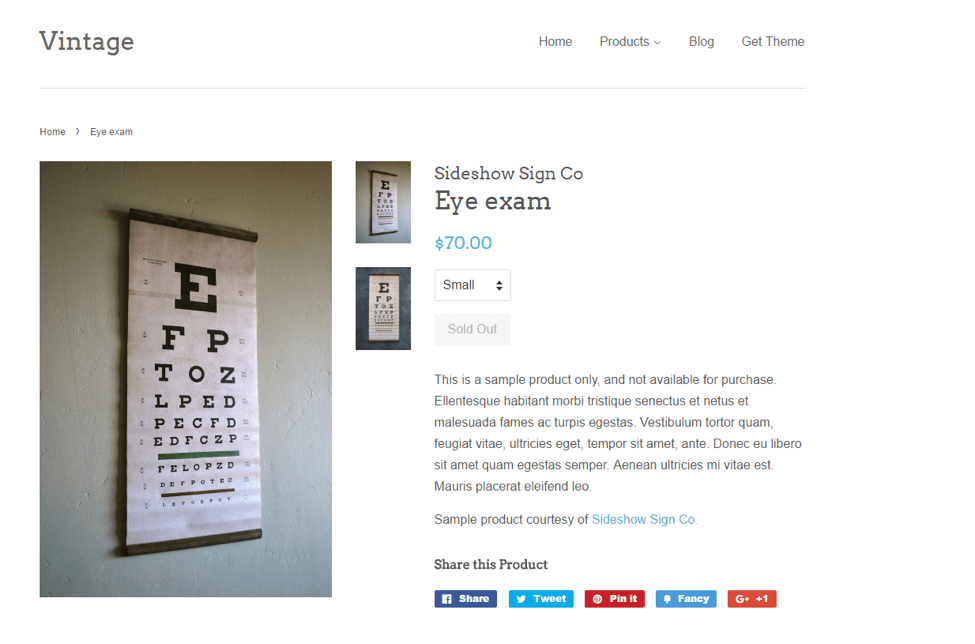
The free Minimal Theme on the Shopify Theme Store is a good example of a product page layout that’s not only familiar to most customers, but also includes other essentials of product page design. Shopify also has many free themes with intuitive layouts that can help enhance the look of your product pages.
Social Sharing Buttons
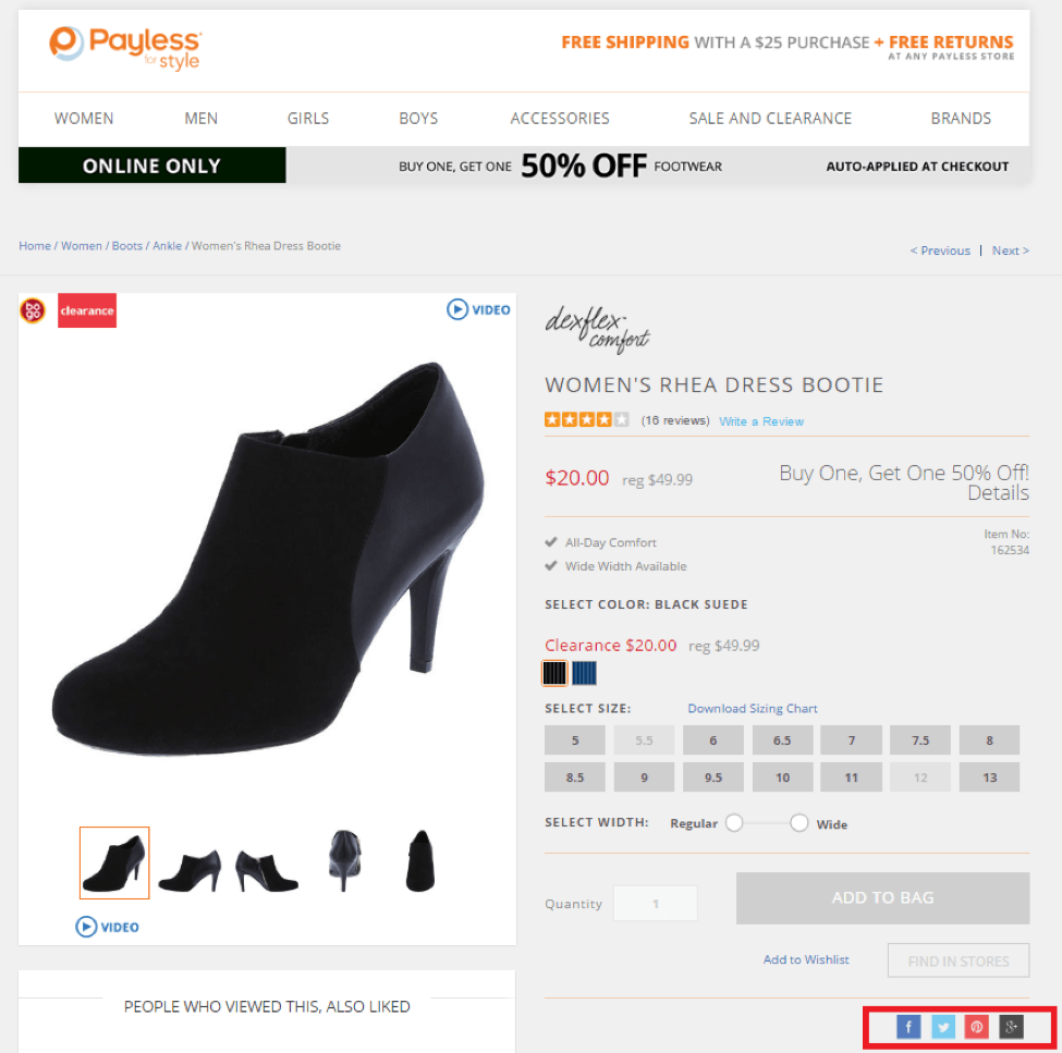
Social sharing buttons are great for promoting your product page, especially when you have a popular product. Unfortunately, they can also have a negative effect on your conversions. Doing A/B testing on your store will help you determine whether or not social sharing will work for you.
According to VWO, an ecommerce business split tested social sharing buttons and found an 11.9% increase in call-to-action click throughs when removed. They outlined that the social sharing buttons likely don’t convert well when you have no shares on them.
In a test by Kuno Creative, when social sharing had over 500 conversions they had a conversion rate of 9% instead of 2%.
Thus, if you’re a new store, it might be a good idea to remove social sharing buttons. Consider adding them back to your store once you’ve built an audience and send large amounts of traffic to product pages. You can also test to see if having the icons without specific numbers mentioned works well for your store.
Shipping Information
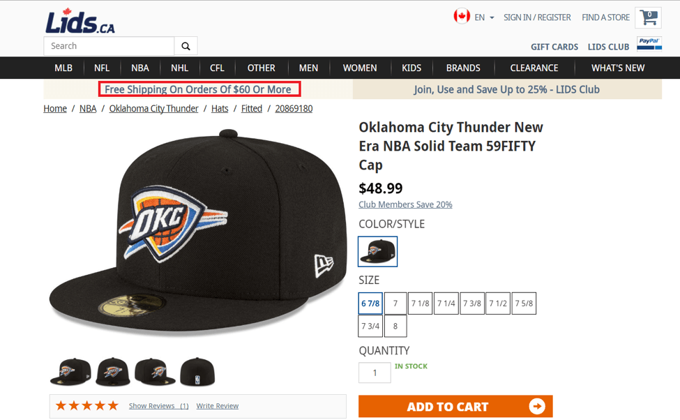
Mentioning or having an icon indicating ‘free shipping on orders over $75’ or ‘free shipping within the US’ helps customers get a snapshot of shipping information.
By having this succinct information on the product page, you prevent the customer from moving off the page to read your shipping information, as the essential point is clarified on the page itself.
Highlighting the requirements of free shipping allows your customer to add more products to their cart if they choose to.
Customer Reviews
Having customer reviews on your product page is essential. If you’re driving traffic to a product page, the reviews on your store can give browsers the extra push towards closing that sale without you doing much work.
According to eMarketer, customer reviews are 12x more trusted than manufacturer descriptions. Thus, having customer reviews can always help boost your sales and convert the customer if they’re generally positive.
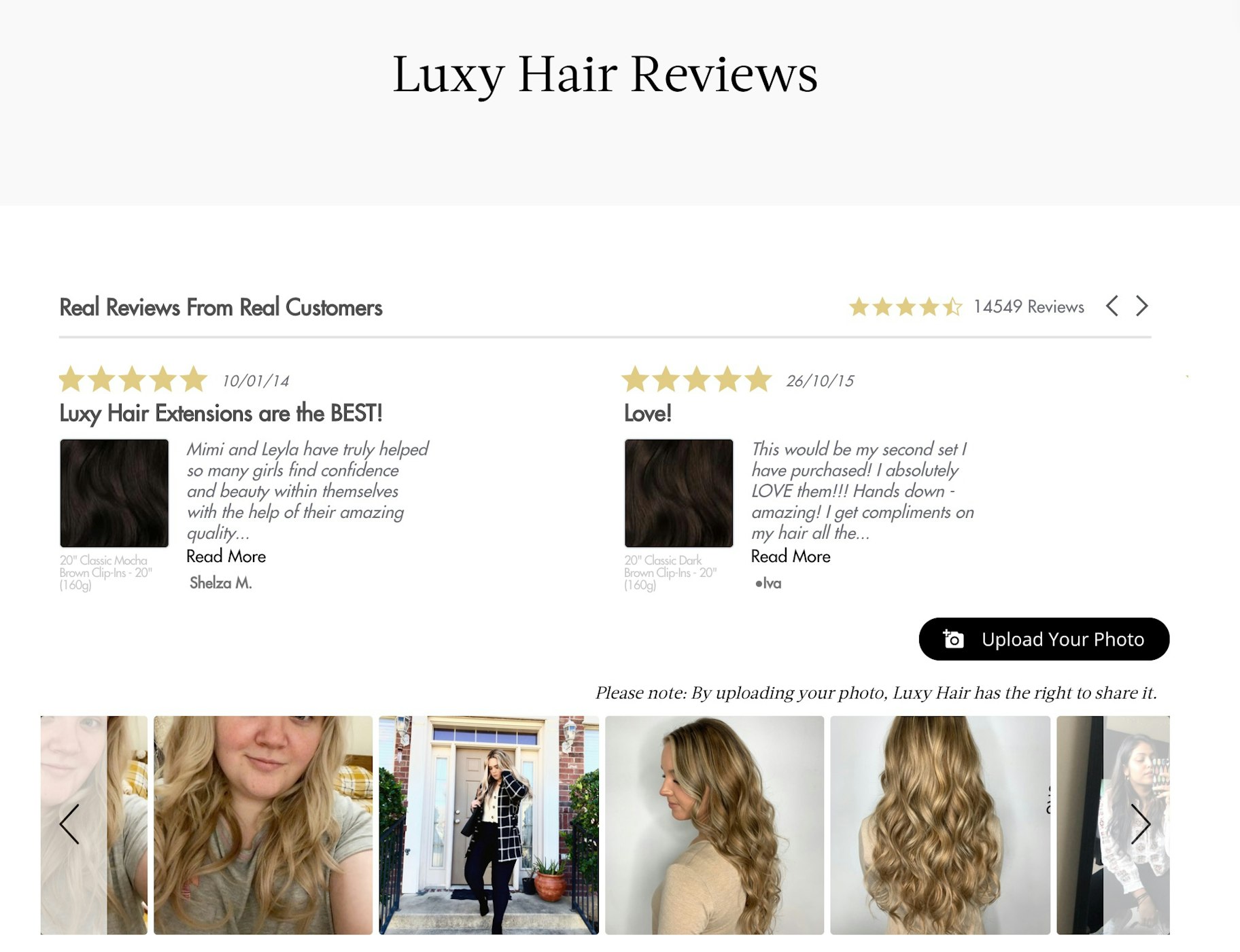
You can use an app like Product Reviews Addon to automatically contact customers after their purchase for reviews. This will allow you to grow your reviews quickly and with minimal work.
Recommended Products
While you might want to a/b test whether this will help with conversions, having recommended products encourage customers to stay on your site a little longer.
Oftentimes, you’ll have models wearing more than just the top you’re selling. If you sell the matching skirt or the earrings the model is wearing, having it in your recommended products will help customers complete their look.
When it comes to recommended products, avoid having products that look too identical. This can cause a customer to become confused and may result in fewer sales. This is because more choices requires more thinking.

For example, you can still cross-sell an item with a similar type of product such as a blouse. However, the blouses need to look different enough from one another to help encourage the sale. Recommending a skirt as a cross-sell that complements that specific blouse can also work really well. It also simplifies the decision as you’re creating an outfit for your customer.
How to Build a Product Page with Shopify
You don’t need to know code to create product pages for your website. With Shopify, you can build pages that have a balance of both good aesthetics and functionality. To customize product pages in Shopify, take the following the steps:
- Go to your Shopify admin.
- Choose ‘Online Store’ > ‘Themes’
- Click ‘Customize’ and then wait for Shopify to take you to Theme editing.
- Pick ‘Product Pages’ from the drop-down menu.
- Start customizing your product page layout.
Best Product Page Examples + What Makes Them Great
Aldo
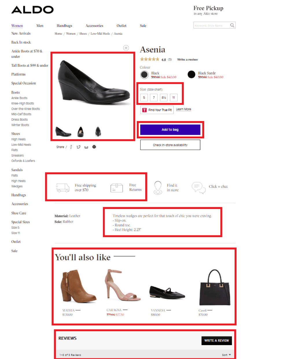
Why we love it: This product page is very intuitive and clean. The product images are high res and there are different angles so a customer can make an informed decision. It also showcases which sizes they have right off the bat in their ‘Size’ section. The ‘Add to Bag’ is a vibrant blue which pops well against their crisp white background.They showcase free shipping and free returns icons directly on their product page for easy access. Their product description is short and to the point with 3 bullet points and one sentence describing the product. It also features a recommended products section with a mix of products that look quite different from the one showcased to prevent customer confusion. Lastly, there’s a reviews section with customer feedback.
Kate Spade
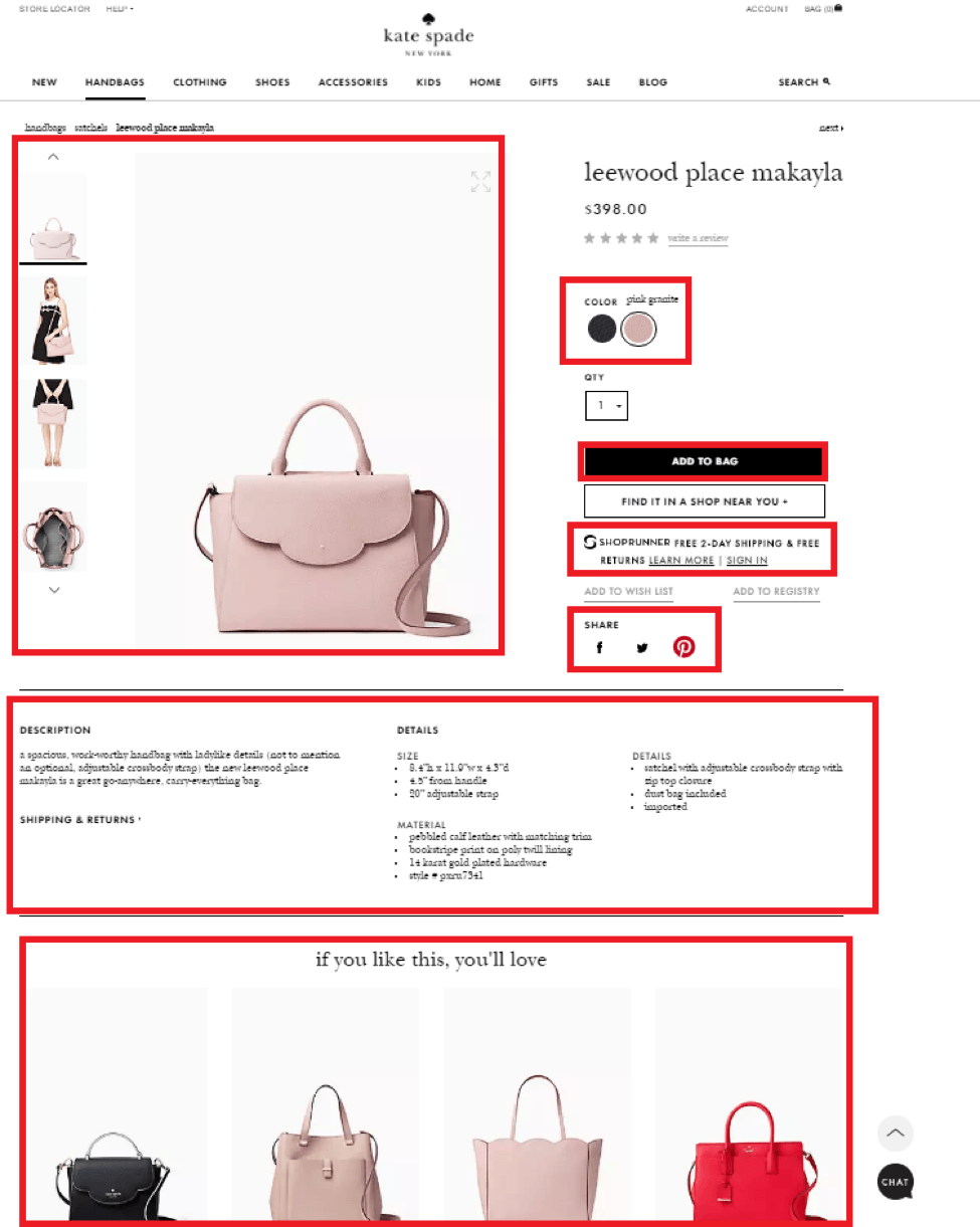
Why we love it: There are several product images showing different angles. There are also images showing a person using the product. The ‘Add to Bag’ pops against the white background and suits the company branding. Shipping and return information is listed on the product page. The social sharing buttons don’t mention how many people have used it which is great if they have low shares. The product description is succinct and there are many bullet points used for easy reading. They also have a selection of recommended products, though a few seem too similar and may cause confusion.
Urban Outfitters
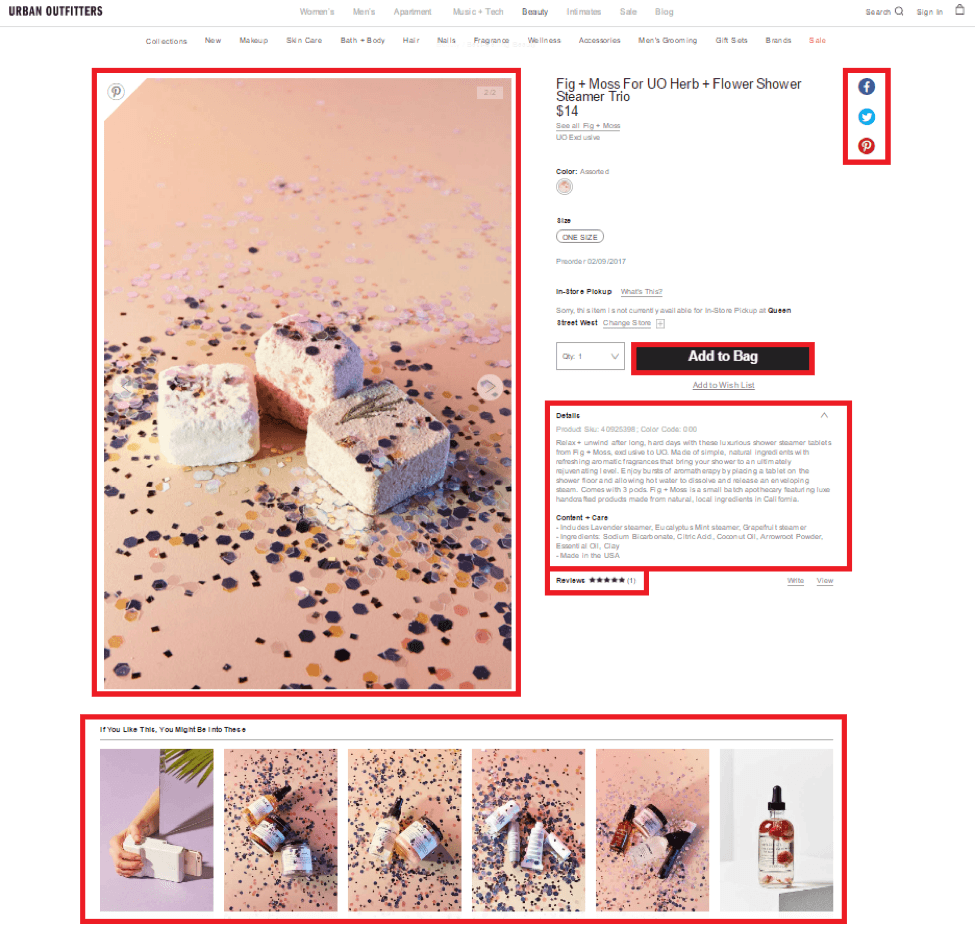

Why we love it: The product image pops against a plain white background. The image is unique and has an uncommon style which makes it attention grabbing. The black ‘Add to Bag’ pops against the crisp white background. The social sharing buttons are visible but not the focus, they also don’t detail any specific numbers. The copy is relatively short with bullet points available. There are also reviews available on the page. The recommended images would’ve worked best if there weren’t as many with the similar style photography. However, the one on the far right pops well against the similar styles of the other products.
Disney Store
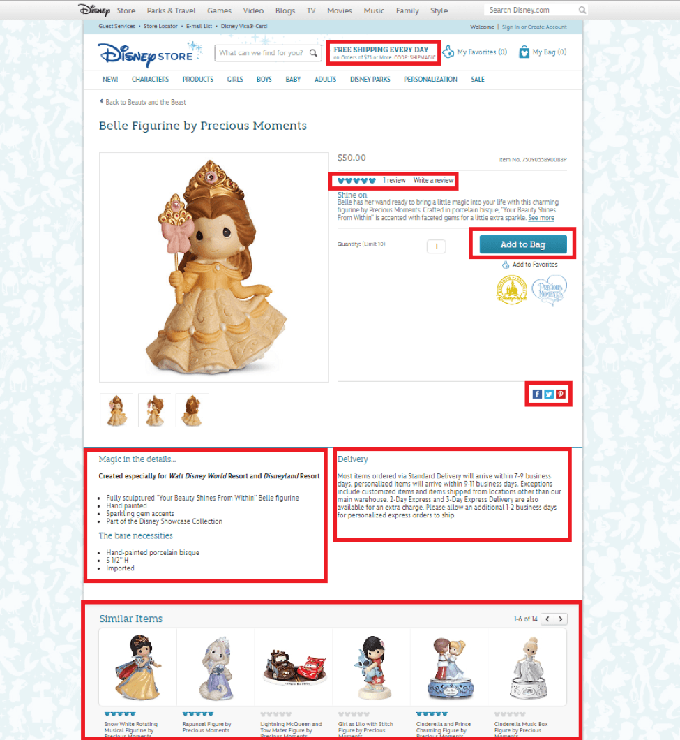
Why we love it: The Disney Store’s product page is clean. It features shipping information in the header. There are different angles shown for the product. There’s a review section. The product copy is short, it also features bullet points below the product image. The ‘Add to Bag’ contrasts against the white background while staying consistent with the product branding. However, a different color may convert better. Delivery information is also available within the product page. The similar products features a similar style of products but with different characters which would pop to someone familiar with the Disney brand.
Guess
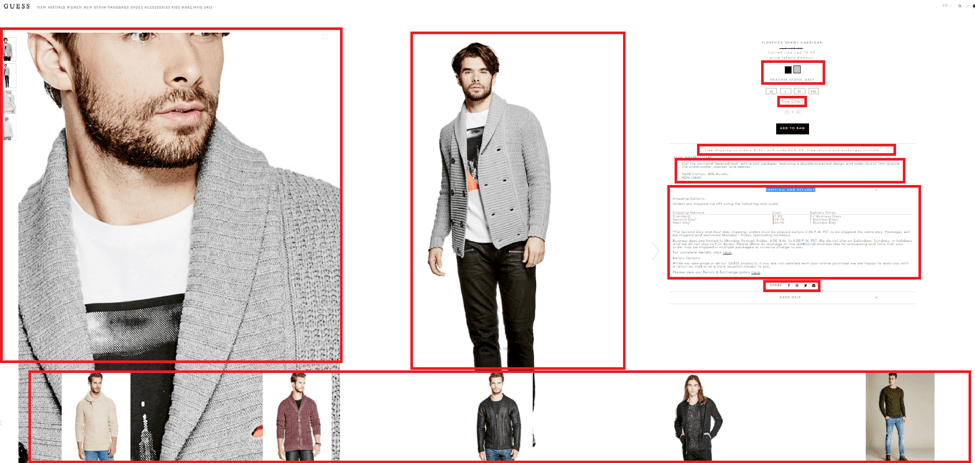
Why we love it: The product page features a very large zoom feature that allows customers to see the fine details of the product image. There are also several pictures showcasing different angles. The recommended products below feature different styles and colors to avoid confusing the customer with their choice. A size chart is available on the product page. Shipping information is also made clear. The product description is short and features two bullet points. The social sharing icons are small, those not distracting the customer. They also don’t detail how many shares there are. The ‘Add to Bag’ button is small but it’s all black color contrasts well against the white background.
Ready to Make High-Converting Product Pages?
Effective product pages instantly convey the value of your items. They tell potential customers what the product feels like, which gives them confidence to move ahead with the purchase.
So if you haven’t given much attention to your product page designs, now is the time to do so. With some changes, you can significantly improve the conversions they bring. Follow the advice in this article to ensure your product pages answer people’s questions and get them ready to check out.


Summary: Product Page Design Best Practices for 2021
- Include an epic product description
- Post the perfect product images
- Add a sense of urgency
- Ensure the layout is intuitive
- Test social sharing buttons
- Include shipping information
- Feature customer reviews
- Include recommended products
Want to Learn More?
- How to Write Epic Product Descriptions That Sell
- How to Get Ecommerce Product Reviews
- 15 Product Photography Tips That’ll Make You More Money
- Ecommerce Roadmap: How to Start Ecommerce Business That Will Succeed
Is there anything else you’d like to know more about and wish was included in this article? Let us know in the comments below!
