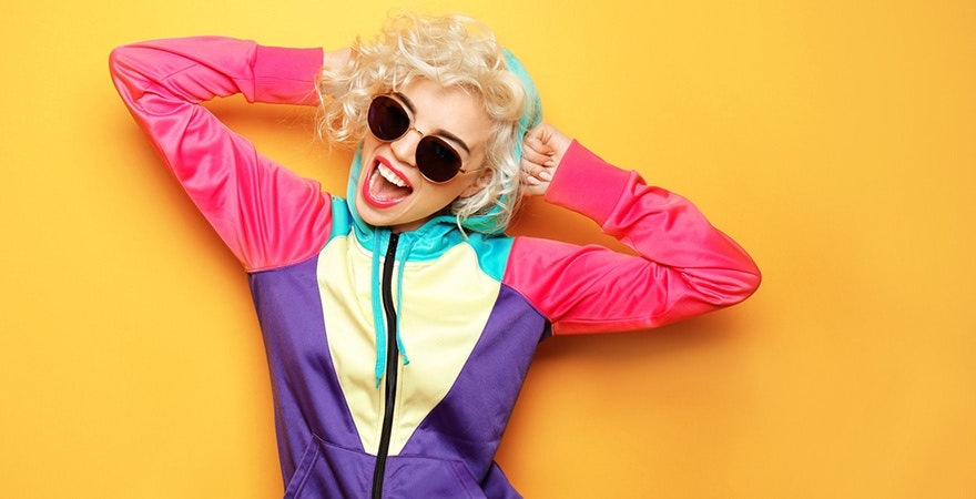
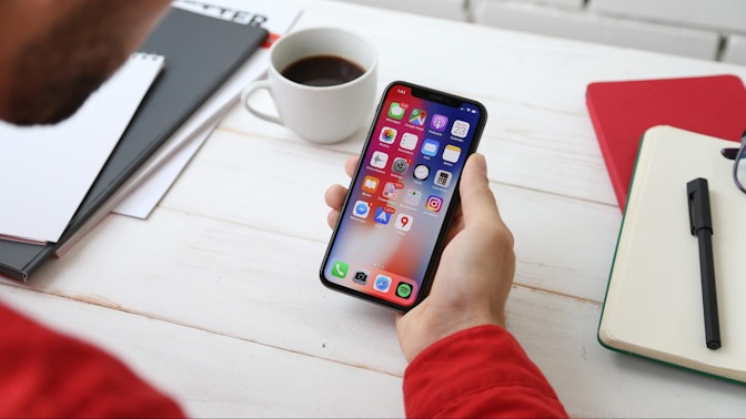
Have you ever been drawn to a brand because of its colors? That’s color psychology subtly influencing your subconscious. Brands use specific colors in their logos and packaging to evoke certain feelings. A vibrant red can convey excitement and passion, while a calming blue might inspire trust and reliability.
But what exactly is color psychology, and how can you use it in your marketing and branding strategies? Let’s break it down.


What is color psychology?
Color psychology explores how colors impact human behavior and feelings. It’s particularly significant in marketing, where the right choice of brand colors can deeply affect customer perception and brand recognition. Did you know that color alone can influence up to 90% of snap judgments about certain products? Understanding color psychology can help you design campaigns that result in profits and loyal customers.
Importance of color psychology
Color psychology is essential for businesses because it uses color combinations to connect with people in different ways. Here’s why it’s so important:
- Matches cultural preferences: Colors mean different things in different cultures. Brands use this knowledge to tailor their colors to each market, making sure they appeal to local tastes.
- Sets the right mood: In places like offices or shops, colors play a big role in how people feel. A startup’s office with calming blues, for instance, helps employees relax.
- Improves digital experiences: On websites and apps, colors are crucial for user experience. The right colors guide users easily, making information clear and the site pleasant to use.
Choosing the right color palette for your brand
When establishing your brand identity, choosing the right colors is key. Here are some options to help you start:
Red
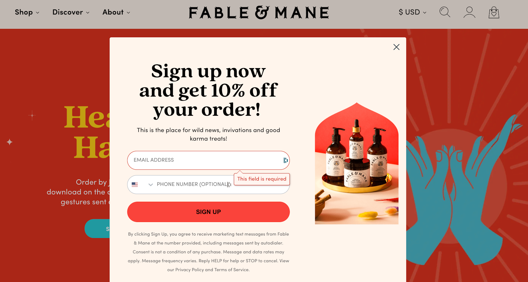
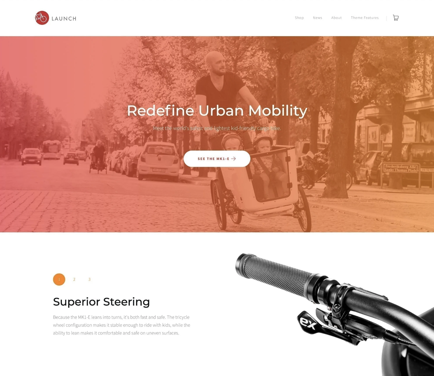
Red really grabs your attention. It’s a color full of energy, excitement, and sometimes even a hint of danger. That’s why you often see it on Order Now buttons or product packaging. However, red is also intense and can stir up feelings of danger and anxiety. So, it’s best to use it just enough to make an impact.
Orange
Orange in color psychology symbolizes creativity, adventure, and enthusiasm. It’s a lively color, but not as overpowering as red. This makes it a great choice for adding excitement to images, websites, and marketing materials. Marketers commonly use it for call-to-action buttons or to draw attention to specific areas on a website.
Yellow
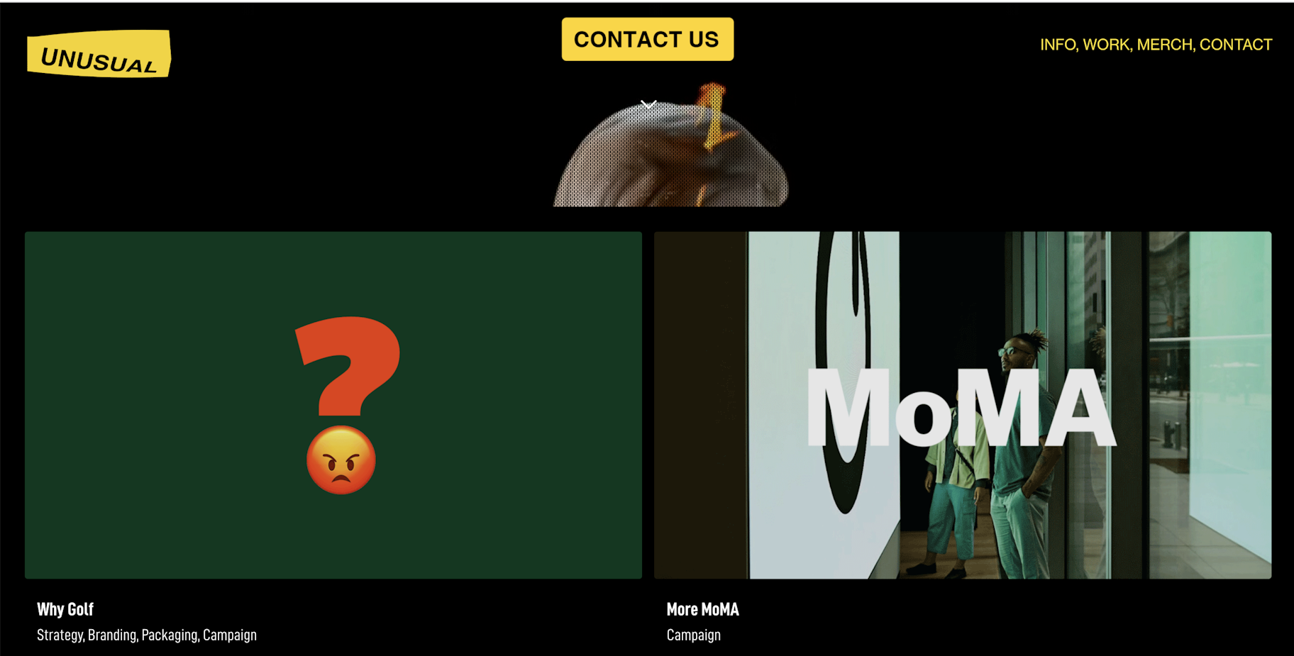
In color psychology, the color meaning for yellow revolves around sunshine. It evokes feelings of happiness, positivity, optimism, and summer, but also of deceit and warning. Some brands choose to use a cheerful yellow color as the background or border for their website design. You can also choose to use yellow for your Free Shipping bar at the top of your website, if it matches the rest of your site’s design. A little touch of yellow can help your website visitors associate your store with something positive.
Pink
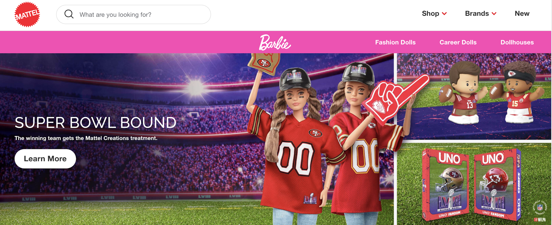
Pink is a primary color for brands that primarily serve a female audience. In color psychology, pink’s color meaning revolves around femininity, playfulness, immaturity, and unconditional love. Some brands choose to use pink for product packaging of girls’ toys. Other brands use pink highlights in their logo or website design, or to highlight key messages.
Green
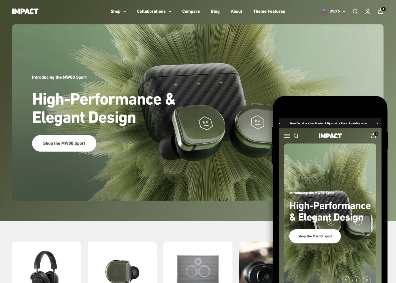
Green in color psychology is highly connected to nature and money. Growth, fertility, health, and generosity are some of the positive color meanings for the color. The color meaning for green also carries some negative associations, such as envy. If you’re in the health or fitness niche, you might choose to add more green to your online store. For example, your homepage banner image or logo might include a green background.
Blue
Blue ties closely to the sea and the sky. Stability, harmony, peace, calm, and trust are just some of the feelings your customer may feel about your brand when you use the color blue. Conversely, blue can also carry some negative color meanings, such as depression, and can bring about a sense of coldness. You can use blue as a complementary color in your website’s logo or top navigation. Some retailers use blue in their guarantee, trust certification, or free shipping icons to strengthen the trust aspect the color is known for.
Purple
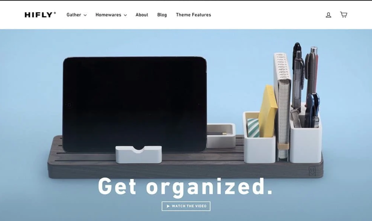
In color psychology, purple is a royal color. The color meaning for purple is connected to power, nobility, luxury, wisdom, and spirituality. But avoid using the color too much, as it can cause feelings of frustration. Some perceive its overuse as arrogant. You can add hints of purple to your website’s design, such as on your free shipping bar or your logo, or as an accent color in your graphics.
White
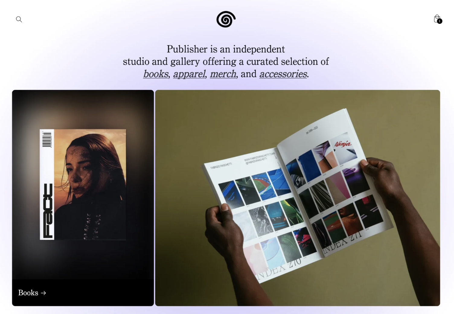
In color psychology, white represents innocence, goodness, cleanliness, and humility. This color is commonly used as a background in design because of its ability to make other elements stand out. Additionally, white provides a crisp, clean feel and offers a sophisticated contrast when paired with bright colors on a page.
Black
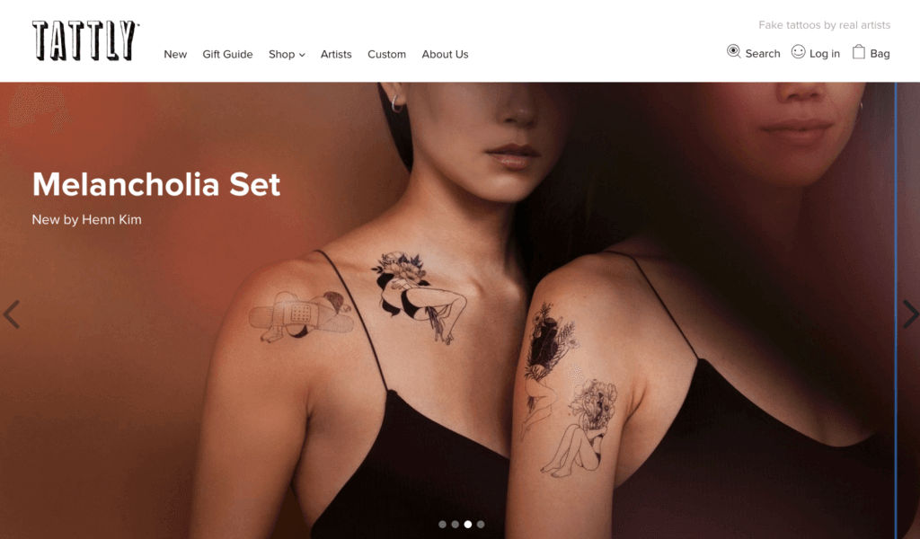
Black is symbolic of mystery, power, elegance, and sophistication. In contrast, it can also evoke emotions such as sadness and anger. Many fashion retailers use black in their logos. Black is also a popular color for text, as it’s an easy color to read. Some brands choose to use black and white photos for lifestyle banner images or icons to create a certain tone or consistency on their website.
Gray
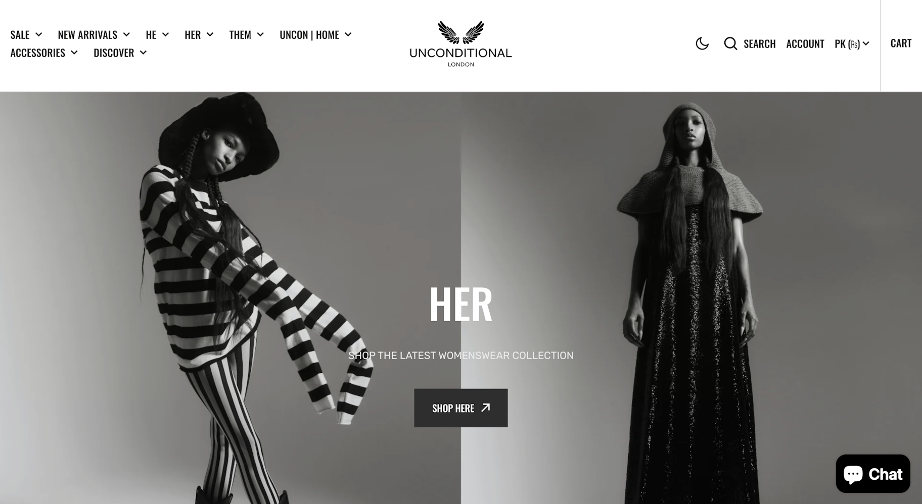
Grey in color psychology symbolizes neutrality and balance. This color can influence human behavior by conveying a sense of calm and understatement. Businesses often use gray in their branding and design to communicate professionalism and reliability. Additionally, gray can serve as a neutral backdrop in design, allowing other colors to pop and draw attention without overwhelming the viewer.
Brown
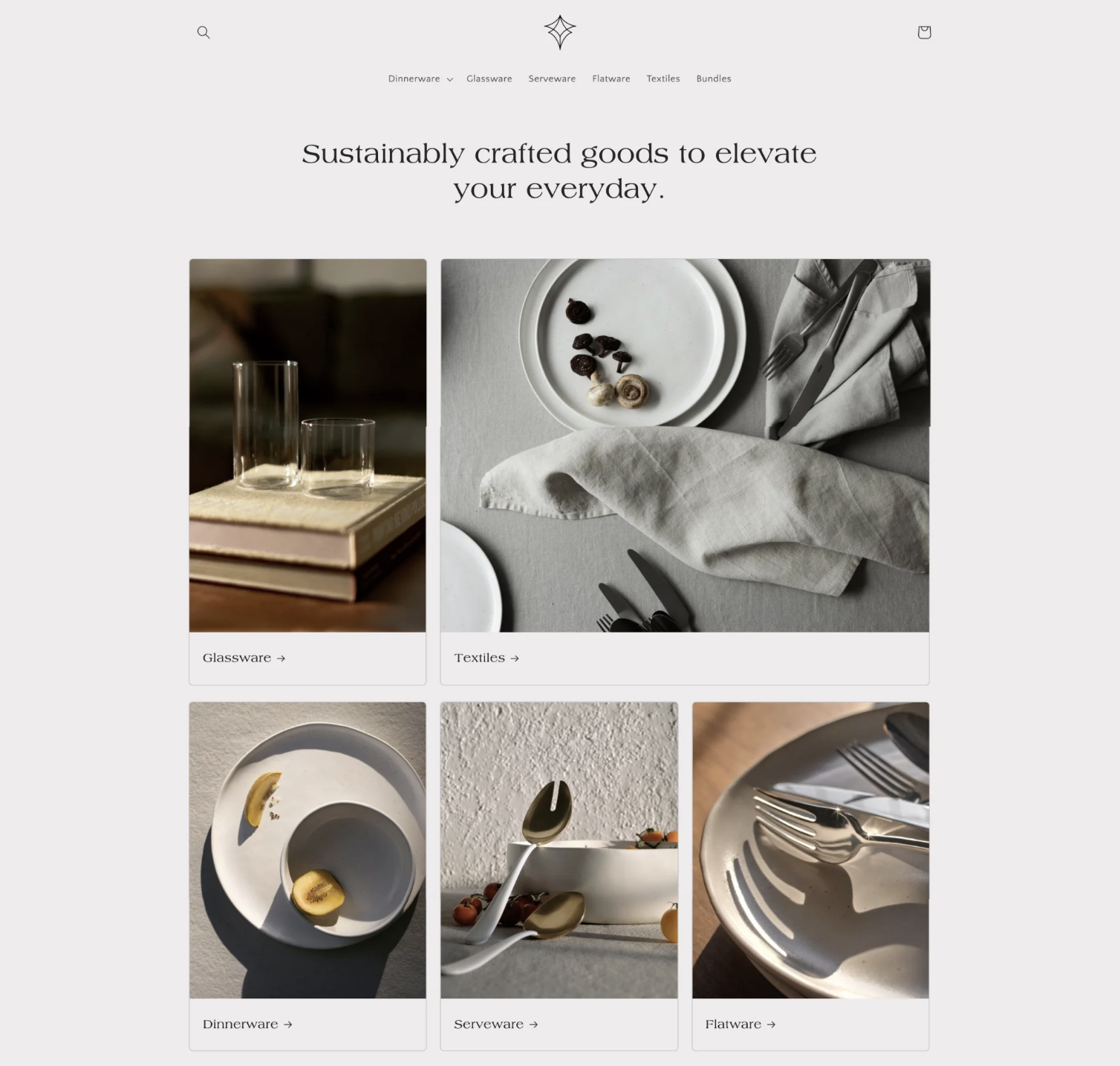
Color psychology tells us that brown brings feelings of comfort and security. That’s why it’s a go-to color in marketing for natural or food-related items. You’ll also see brown used in logos and banner images, where its earthy tones can create a sense of reliability and trustworthiness. In design, brown works well in color schemes that aim for a warm, inviting feel.
Color and its impact on our emotions
Colors play a big role in how we feel and make decisions because they trigger emotions.
Take red, for instance. It makes our heart rate jump and creates a sense of urgency. That’s why you often see red on sale signs. Red ink on a graded test? It can set off alarm bells in our heads. When choosing a bank, we might skip the one with pink branding and go for blue instead, as blue gives off a vibe of trust and security.
According to color theory, every color can affect us in different ways, from making us happier to causing anxiety.
One study showed how people link certain colors with specific emotions:
- Red is often linked with love by 68% of people.
- Yellow brings joy to mind for 52%.
- Black is tied to sadness for 51%.
- Pink also relates to love for 50%.
- Orange is connected with joy for 44%.
- White is associated with relief by 43%.
- Green brings contentment to mind for 39%.
- Brown is linked with disgust by 36%.
- Blue is tied to relief for 35%.
- Purple is associated with pleasure by 25%.
How to identify the right colors for your brand
Choosing the right colors for your particular brand isn’t a one-size-fits-all process. A lot of it depends on what you personally like—if you’re not a fan of purple, it’s unlikely you’ll want it as a main color for your brand.
But it’s also important to think about how these colors will affect how customers experience and perceive your brand.
1. Define your brand’s persona
First, think about what you’re selling. Are your products fun and quirky or more serious? This will guide your color choices. For a playful brand, bright colors work better than muted tones.
2. Align colors with your audience
Consider who you’re selling to. Different colors speak to different people. If your audience is more spiritual, maybe go for purples and greens rather than reds and oranges.
3. Check out competitors’ colors
See what colors others in your market use. If most use blues and blacks, they might be onto something. But be careful with overly bright colors if they don’t fit your audience.
4. Opt for unique color choices
While you should know what colors others use, find a way to be different. This could mean using an unusual shade or contrasting colors. Just make sure it fits your brand and audience. For example, Mint Bank uses pale green, unlike the typical blues in banking.
5. Test and refine
Keep a record of the changes you make. Don’t shy away from trying new things with the color wheel. The best way to see what works is to test different color preferences and see how your customers respond. You might be surprised by what they like.
Examples of color psychology in marketing
Nike: Black for strength and style
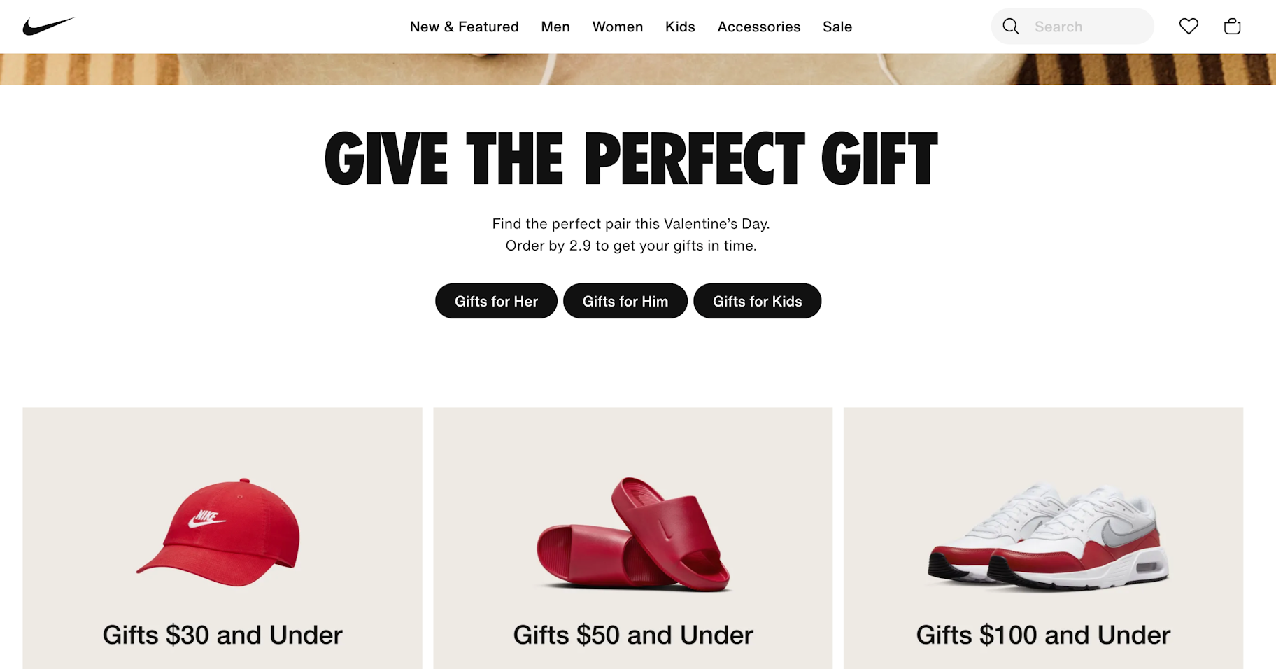
Nike’s use of black in its branding shows off power and sleekness. It’s a great fit for a brand that’s all about performance and style.
Apple: Gray for sophistication and elegance
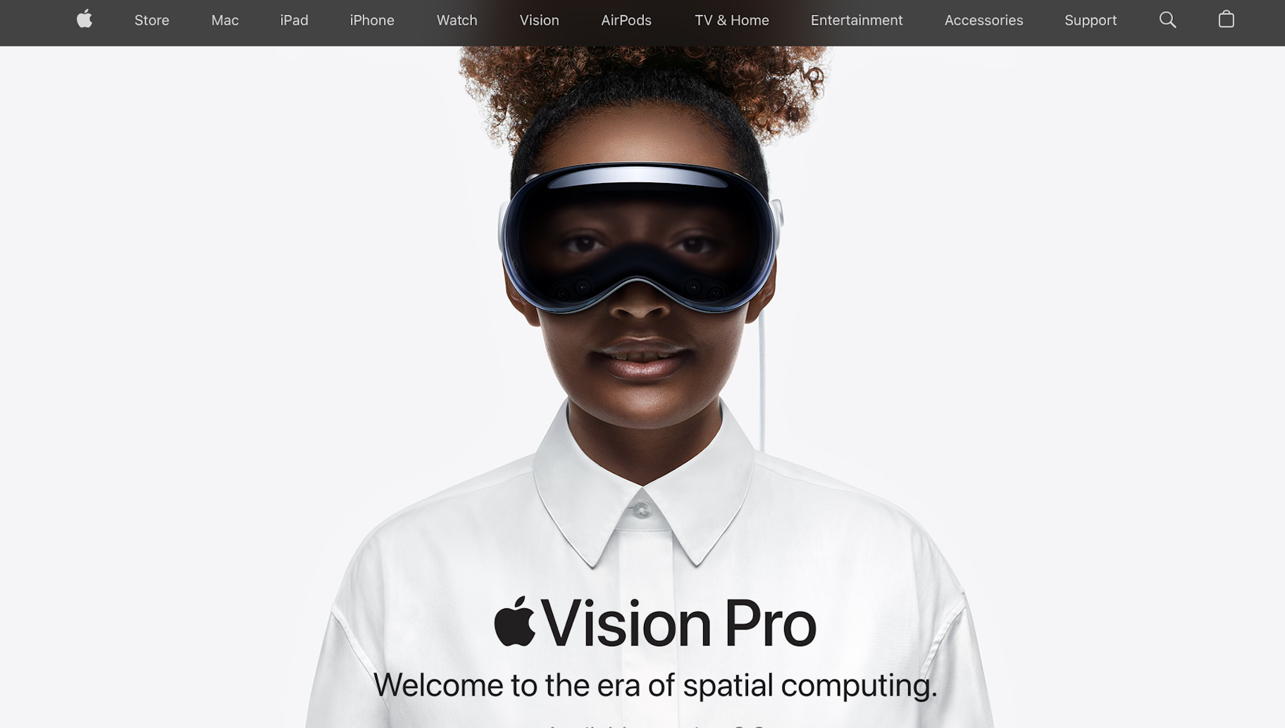
Apple keeps it sleek with whites and grays. These colors give off a futuristic, elegant feel, just like its brand.
IKEA: Yellow for fun and simplicity
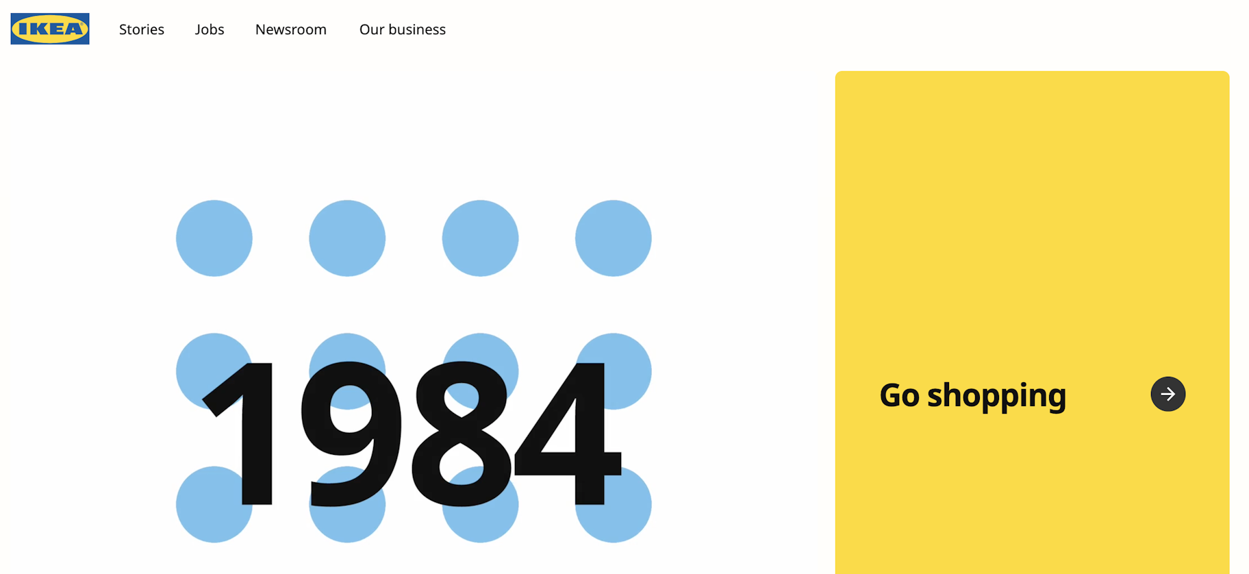
IKEA’s bright yellow colors shout fun and playfulness. This matches the experience of assembling its furniture perfectly.
Barbie: Pink for fun and charm
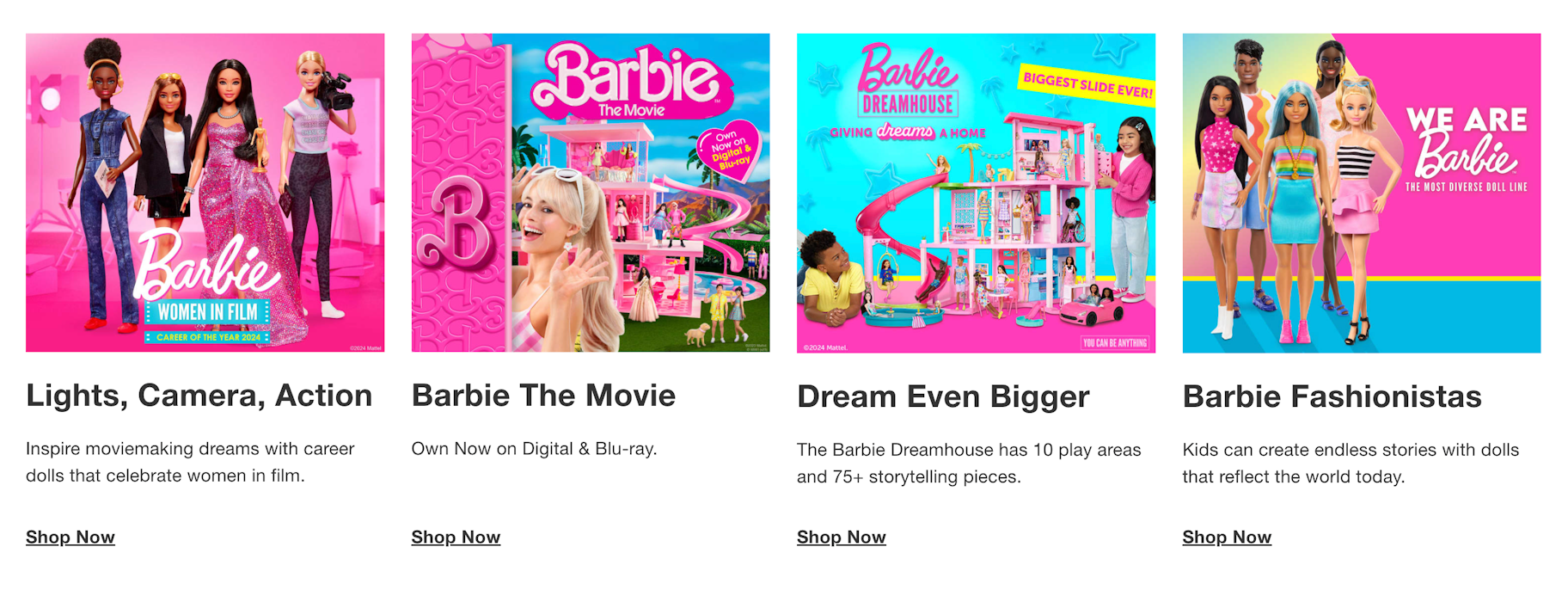
Barbie’s pink palette is a key part of her appeal. This color choice really nails the brand’s playful and charming vibe.
Using color psychology to your advantage
Now that you’ve learned what color psychology is and what the most common color meanings are for each color, it’s time to apply them to your business.
While many niches use common colors, such as blue for health care, you don’t always have to follow the rules.
Consider choosing colors that represent what you want your brand to be about or what you want your customers to feel when browsing your online store.
Color psychology FAQ
What does psychology say about colors?
Colors can influence people’s emotions and thoughts. Warm colors like red, yellow, and orange are known to evoke happiness and a sense of comfort in individuals. In contrast, cool colors such as blue and green often induce feelings of calmness and trust in people.
What is the best color psychologically?
The best color psychologically is the color that resonates with your brand personality. It ties in with the nature of your brand, what you’re selling, and who your target audience is. When choosing a color palette, focus on how you want your brand to be perceived and the emotions you wish to invoke in people when they visit your website.
Is color psychology a real thing?
Yes, color psychology is a real field. It looks at how colors impact our thoughts and feelings. Researchers study how various colors and shades affect our emotions and choices. People’s reactions to colors are shaped by lots of things, like age and cultural background.


Want to learn more?
- Design Your Line: 21 Ready-To-Use Online T-Shirt Templates and Mockups
- 26 Free Business Name Generators to Find the Best Brand Names
- Brand Awareness: 5 Tips for Creating a Powerful Brand Identity
- The Ultimate Guide to Starting a Women’s Clothing Brand
- 10 Branding Statistics You Need to Know [Infographic]
