Color wields immense power in branding, influencing how your audience feels and reacts to your message. But are you aware that certain color pairings can magnify this effect? The right color combinations can significantly enhance your brand’s impact, making it more memorable and engaging to your target market.
We’ve curated a list of top color combinations to spark ideas for your next campaign. Before we look at them, let’s take a moment to understand the basics of color theory and the color wheel.

Color theory explained
Color theory is the study of how colors interact and influence emotions. It is a valuable resource for brands looking to create a strong visual impact. Color theory enables you to choose a color scheme that resonates with your audience and clearly communicates your brand’s identity.
The psychology of color
Now that we’ve had an introduction to color theory, we should take a quick peek at the psychology of color.
Choosing a color combination is not about choosing the colors you like; it’s about choosing the colors that evoke the emotions you seek from your audience. This is important because the colors and hues you choose set the tone for how your customers and clients feel about your website, business cards, and/or office space.
→ Click Here to Launch Your Online Business with Shopify
Below is a quick rundown of different hues and the feelings they often elicit:
- Red: excitement, danger, energy, courage, strength, anger
- Orange: creativity, enthusiasm, health, happiness, encouragement, balance
- Yellow: sunshine, hope, optimism, light, positivity, freshness
- Green: health, nature, renewal, generosity, freshness, environment
- Blue: freedom, trust, expansiveness, dependability, faith, inspiration
- Purple: royalty, luxury, power, pride, creativity, mystery
Warm colors usually create energy and excitement and evoke passion, while cool colors calm and relax.
If you’re interested in learning more about the psychology of color and how color meanings affect you, read our full post.
The color wheel and its use
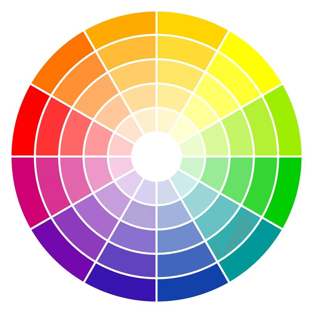
The color wheel is a visual representation that outlines the relationships between colors. Designed by Sir Isaac Newton in 1666, it serves as the foundation of color theory.
The color wheel demonstrates how colors mix, complement, and contrast with one another. It begins with the primary colors: red, blue, and yellow. These are the essential components for creating the rest of the color spectrum depicted on the wheel.
When you mix two primary colors, you get a secondary color. For instance:
- Mixing red and yellow makes orange.
- Mixing blue and red makes purple.
- Mixing yellow and blue produces green.
Beyond these, mixing a primary color with its directly adjacent secondary color produces a tertiary color. This process yields shades like yellow-orange, red-violet, and blue-green. Tertiary colors make for a richer and more diverse color palette that brands can draw from to create visually appealing composition.
Types of color combinations
The color wheel provides a foundation for exploring and experimenting with different shades in your campaigns. Some of the popular color combinations to consider include:
Monochrome color combinations
A monochrome color combination consists of varying tints, shades, and tones of the chosen hue. For example: dark blue, slightly lighter blue, and light blue. These combinations are great for simplifying busy designs and creating a harmonious, visually appealing look.
Complementary color combinations
Complementary colors exist directly across from one another on the color wheel. These colors are highly contrasting and can make your design boldly stand out with high contrast. You can find this color pairing in the logos of many well-known brands, such as McDonald’s (red and yellow) and FedEx (purple and orange).
Analogous color combinations
An analogous color combination comprises colors that neighbor each other on the color wheel. This arrangement creates a pleasing and coherent visual effect, reminiscent of the color harmonies found in the natural world.
Split complementary color combinations
The split complementary combination is a variation of the complementary color scheme. It comprises one main color and two colors symmetrically placed around it. This pairing creates a balanced mix of three hues that work together harmoniously, adding versatility to your color palette.
Triadic color combinations
Triadic color schemes are a variation of the split complementary scheme. The first color in triadic color palettes is the dominant color, and the colors that follow are accent colors. Triadic schemes often convey a sense of vibrancy and enthusiasm.
Tetradic color combinations
Similar to the triadic color scheme, the tetradic color combination involves colors that are equally spaced on the color wheel. However, tetradic combinations take it a step further by incorporating four colors instead of three. This arrangement offers a broad spectrum of colors and can evoke a sense of diversity and versatility in design.
19 trending color combinations to inspire your campaigns
1. Navy and cream

Navy meets cream for a look that combines sophistication with calm. Navy offers strength and reliability. Cream adds lightness and warmth. This pair suits brands aiming to create a premium yet inviting feel.
Hex codes: Navy #000080, Cream #FFFDD0
2. Coral red and pastel yellow

Swapping out classic red for a softer coral and pairing it with a pastel yellow puts a modern twist on a classic favorite. This combination is an ideal choice for brands looking to infuse their identity with a sense of cheerfulness and contemporary flair.
Hex codes: Coral red #F96167, Pastel yellow #F9E795
3. Charcoal and yellow

It’s hard to beat this classic pair. Charcoal offers a solid, grounded base, while yellow pops against it, adding a burst of energy and optimism. This combo works well for a wide range of brand assets, including logos, packaging, and marketing materials.
Hex codes: Charcoal #101820, Yellow #FEE715
4. Soft pink and olive green
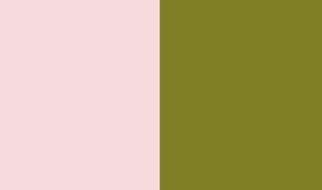
Soft pink and olive green create a harmonious, earthy palette. The pink is gentle and welcoming. Olive green brings a natural, sophisticated vibe. This pairing suits brands looking for an approachable yet stylish identity.
Hex codes: Soft pink #FADADD, Olive green #808000
5. Lime green and charcoal gray

Lime green pops against a charcoal gray background. The gray offers a solid, professional base. In contrast, lime green brings in a dash of energy and innovation. Brands use this mix for a modern, yet grounded appearance.
Hex codes: Lime green #32CD32, Charcoal gray #36454F
6. Royal blue and pale yellow

Royal blue and pale yellow make a fantastic color combo that’s both classy and welcoming. The strong deep blue, along with the cheerful pastel yellow, says ”we’re solid, dependable, and trustworthy.” These colors are a perfect fit for industries like insurance, fintech, and banking.
Hex codes: Royal blue #234E70, Pale yellow #FBF8BE
7. Dusty rose, sage green, and matte black
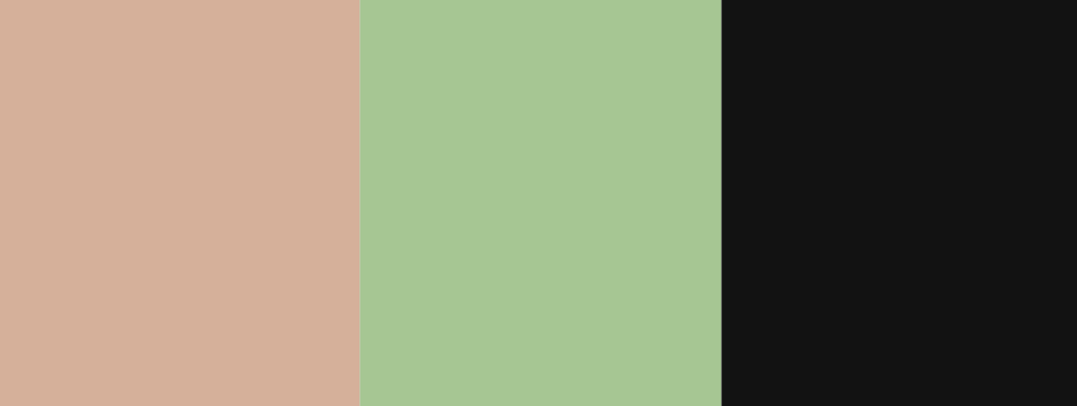
Dusty rose, sage green, and matte black unite in a palette that mirrors today’s design preferences. Dusty rose offers a muted, romantic touch. Sage green adds a natural, calming element. Matte black provides a modern, sleek contrast. This combination is celebrated for its sophisticated yet earthy appeal—perfect for brands that aim to be on-trend and timeless.
Hex codes: Dusty rose #DCAE96, Sage green #9DC88D, Matte black #121212
8. Baby blue and white

Baby blue and white reflect the clarity and trustworthiness of a sunny sky. This serene pair is well-suited for industries like health care and child care, where conveying trust and calm is essential. Brands seeking to embody these qualities in their visual identity can leverage the palette to instill confidence in their audience.
Hex codes: Baby blue #8AAAE5, White #FFFFFF
9. Periwinkle, pink, and lime

Periwinkle, pink, and lime—this is one of the most dynamic color combinations brands can explore. Fashion and creative agencies can use this vibrant mix to make statements in campaigns or branding materials that demand attention.
Hex codes: Periwinkle #678CEC, Pink #D49BAE, Lime #BBCB50
10. Raspberry red and graphite gray

Raspberry red matched with graphite gray presents a bold, luxurious appeal. High-end brands—especially in fashion and automotive industries—can utilize this palette for its powerful and refined allure in marketing materials and product packaging.
Hex codes: Raspberry red #E30B5D, Graphite gray #251F1F
11. Deep purple and mint green

Deep purple meets mint green in a palette that’s both regal and refreshing. Deep purple adds depth and mystery, while mint green brings a sense of freshness and vitality. This unique combination is perfect for wellness or beauty brands seeking a balance between luxury and rejuvenation.
Hex codes: Deep purple #673AB7, Mint green #98FF98
12. Dark chocolate and seafoam green
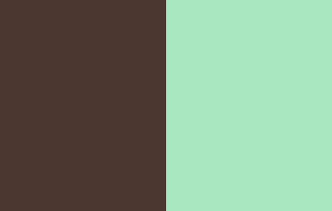
Dark chocolate and seafoam green create a visually appealing contrast. The depth of dark chocolate offers a grounding effect, complemented by the refreshing and vibrant touch of seafoam green. Brands often employ this color combination to craft a look that’s both elegant and welcoming.
Hex codes: Dark chocolate #4E342E, Seafoam green #93E9BE
13. Dark chocolate, caramel, and cream

Dark chocolate, caramel, and cream combine to create a rich, inviting palette. Dark chocolate lays a strong foundation with its deep, indulgent feel. Caramel swirls in warmth and sweetness, balancing the darkness. Cream adds a smooth, light finish, tying everything together seamlessly. Ideal for luxury brands or intimate settings, this combination promises elegance and warmth.
Hex codes: Dark chocolate #4E342E, Caramel #A67C52, Cream #FFFDD0
14. Pastel pink, seafoam green, golden yellow, and coral
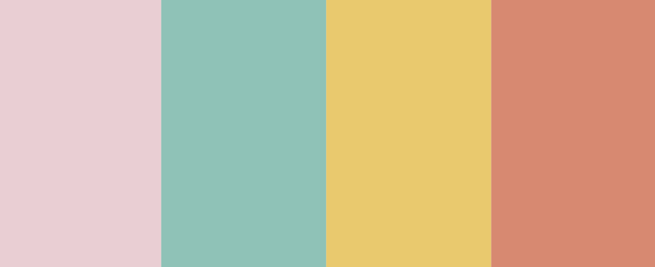
Inspired by the serene beauty of a summer dawn, this palette combines the gentle touch of pastel pink with the vibrant golden yellow of a rising sun. Seafoam green and coral add a refreshing balance, mixing warm and cool colors in a harmonious blend. This playful mix is perfect for crafting youthful, cheerful vibes.
Hex codes: Pastel pink: #EECCD3, Seafoam green #80C4B7, Golden yellow #EEC95C, Coral #E3856B
15. Neon coral, olive mustard, blush pink, and wine red

Channeling the ambiance of a vintage shop with a modern twist, this palette mixes rustic hues with a pop of neon coral for an eye-catching look. Olive mustard and wine red provide a cozy, traditional base, complemented by the softness of blush pink. It’s a unique choice for rustic home décor, vintage-inspired posters, and distinctive product packaging.
Hex codes: Neon coral #B6818B, Olive mustard #57BBBC, Blush pink #B8912E, Wine red #802621
16. Electric blue and lemon yellow

Electric blue and lemon yellow spark a lively, futuristic feel—without overwhelming the senses. This vibrant yet balanced mix is perfect for cutting-edge brands, digital interfaces, sportswear, and programmatic advertising.
Hex codes: Electric blue #7DF9FF, Lemon yellow #FFF44F
17. Bubblegum pink and stale gray

Bubblegum pink and slate gray form a fresh, contemporary duo. The playful, soft hue of bubblegum pink pairs beautifully with the sophisticated, neutral tone of slate gray. This combination balances fun and seriousness, making it ideal for a wide range of campaigns.
Hex codes: Bubblegum pink #F7C5CC, Slate gray #708090
18. Raspberry and shades of blue

Raspberry and shades of blue create a futuristic, sophisticated look. Raspberry adds warmth, while blue brings a cool contrast. This color scheme is a luxurious, mature choice for brands that wish to give a modern, forward-looking vibe.
Hex codes: Raspberry #8A307F, Blues #79A7D3 & #6883BC
19. Sunset orange, cinnamon, and apricot

Sunset orange, cinnamon, and apricot weave together a palette that feels like a warm embrace. These shades are ideal for creating inviting spaces or brands that evoke warmth and comfort. Brands dealing in home décor, wellness, or gourmet foods will find this palette especially appealing.
Hex codes: Sunset orange: #FD5E53, Cinnamon: #8A3324, Apricot: #F1AC88
Experimentation is key
Picking the right color combinations can be tough if you’re not into art and design. You really won’t know how your colors work out until you try them.
That’s why playing around with different hues, tones, tints, and shades is key. It helps you land on the perfect color mix for what you need and what you want to say. And it’s how you get your design to send the right vibe.
Ready to see what works for you? Get your hands dirty and find the palette that tells your story best.


Want to learn more?
- How to Use Photoshop: Photoshop Tutorials for Beginners
- Top 20 Logo Makers Online: Create Your Own Logo
- 17 Easy Ecommerce Store Design Tricks to Skyrocket Sales Now
- 40 Amazing Examples of Ecommerce Website Design
Have any colorful tips or tricks of your own? We’d love to hear them. Let us know in the comments!
